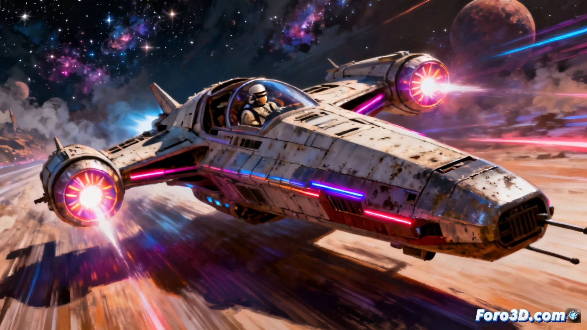
On October 6, Star Wars Galactic Racer lands on PS5, Xbox Series X|S, and PC, a game that hadn't caught my attention until now. But everything changed when I saw the new promotional image. Created by James Lewis-Vines, the illustration has a classic 70s and 80s feel, with loose brushstrokes, soft edges, and large shapes that prioritize silhouette. It's a direct homage to Drew Struzan's style, conveying speed in an organic and somewhat chaotic way.
Rusty ships and design with Ralph McQuarrie's heritage 🚀
The art direction of Galactic Racer moves away from elegance. The vehicles in the poster recall Ralph McQuarrie's work: robust, with worn panels and a rusty look that suggests real use. There are no clean surfaces or perfect lines. The chaotic composition reinforces the sense of speed, with ships that seem about to burst out of the frame. The typography also adds nostalgia, with rounded letters and a retro-futuristic touch that fits the overall tone.
Thank goodness, because current posters look like screenshots 🎨
Finally, a poster that doesn't look like a screenshot with an Instagram filter. In times where everything is perfect renders and glitter, seeing an illustration with paint smudges and blurry edges is almost an act of rebellion. I hope the game is half as charismatic as this poster. If not, at least we'll have something nice to frame while the ship crashes into the first obstacle.