The Donald J. Trump International Airport, formerly Palm Beach, has unveiled a new emblem that seems designed to compete with a gold bar from Fort Knox. The presidential seal with an eagle and olive branches in gold tones has been described as vulgar by the public. What was once a simple and functional design is now a victim of the gold-plating plague that haunts certain projects. It is not an improvement, but an excess. 🦅
The technical process behind the visual disaster 🎨
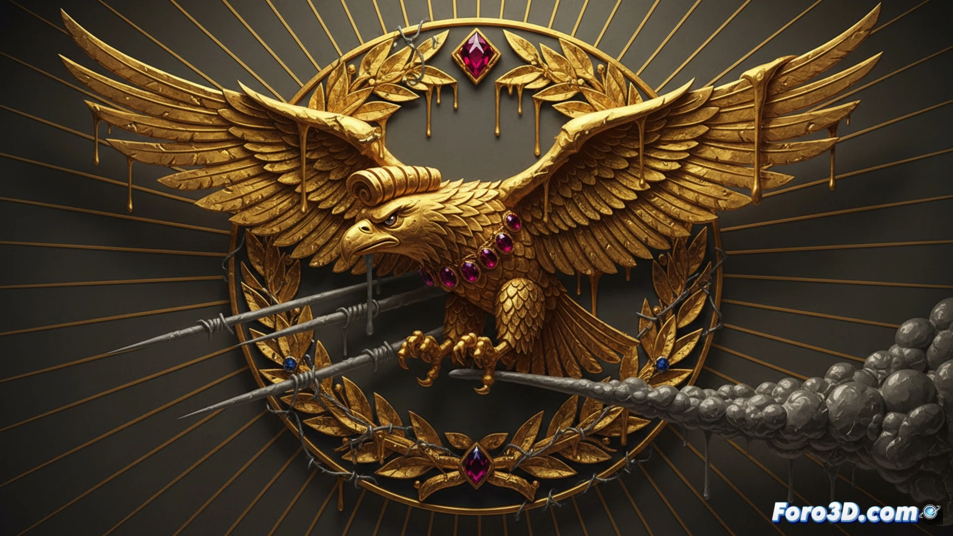
From a graphic design standpoint, the problem is not the gold, but its indiscriminate application. A logo must work at different scales and on various media, from a mobile app to an airplane tail. Here, the details of the eagle and branches are lost at reduced sizes, creating an illegible smudge. Additionally, the contrast between the gold and light backgrounds is low, forcing the use of dark borders that clutter the design. The chosen serif typography reinforces an antiquated, non-airport feel. In short, it is an emblem that fails in readability, scalability, and brand coherence.
The eagle that doesn't fly, but weighs like an ingot ⚖️
Apparently, the new logo was approved by someone who confuses luxury with bad taste. The eagle looks more like an overweight dove after a caviar diet. The olive branches resemble asparagus bathed in glitter. The public has reacted as if the control tower had been painted gold: with perplexity and a certain sense of vicarious embarrassment. Perhaps the only positive thing is that, at least, they haven't changed the airport's name to Trump International Golf Course. For now.