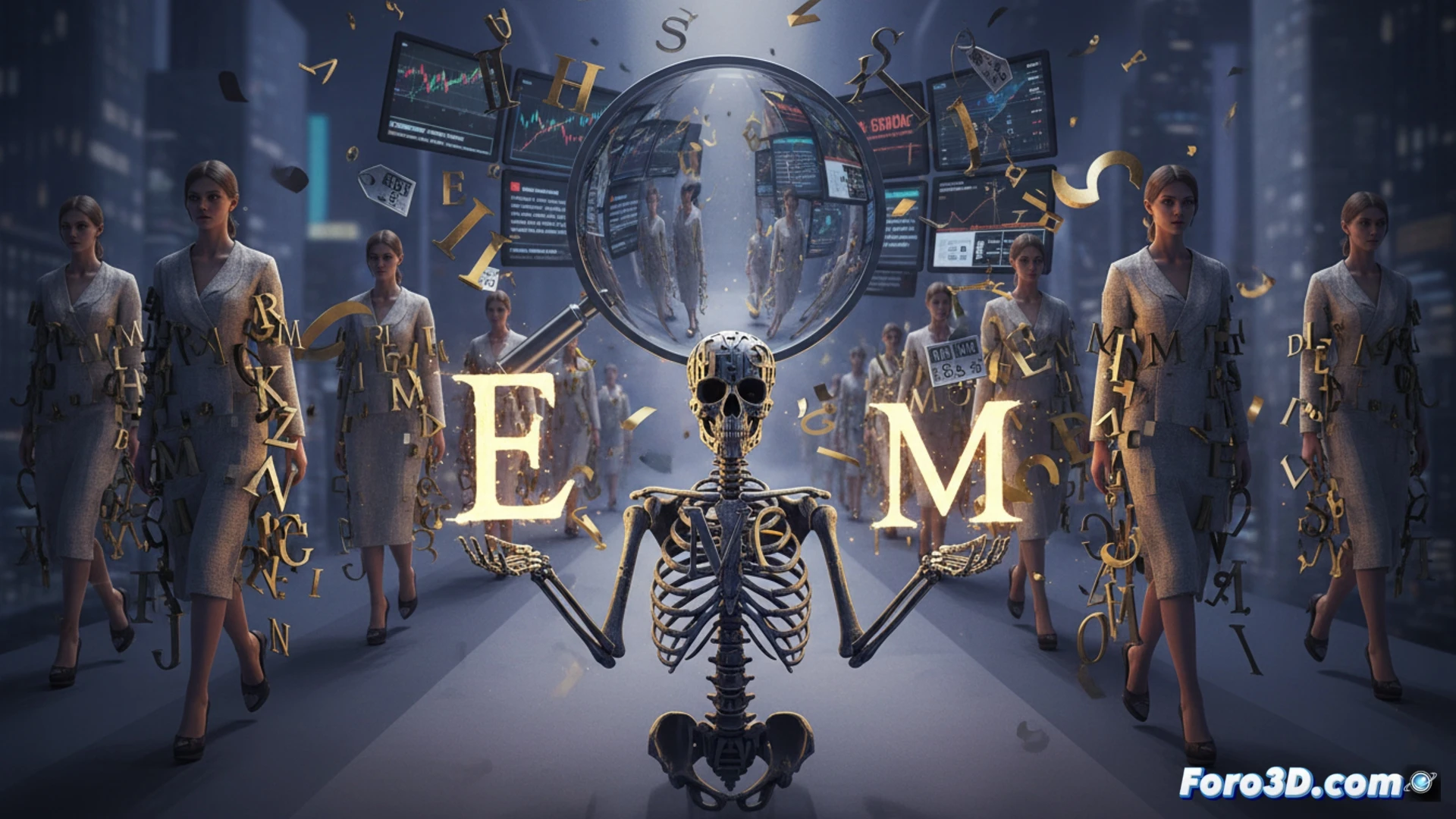
Typography is the invisible skeleton of fashion. Logos and letters define a brand's identity more than the cut of a jacket. During the pandemic, many firms simplified their typographic designs, a move sold as adaptation to the digital world. But it was temporary: now complex strokes are returning. The untold story is that every typographic change is an excuse to raise prices and generate free media buzz.
High-resolution screens: the myth of digital simplification 🖥️
Today's screens, with 4K and Retina resolutions, can display any typographic detail, from microscopic serifs to ornamental flourishes. The argument that digital requires flat, simple logos is false. The real reason for pandemic-era simplification was saving printing costs on labels, packaging, and embroidery. When online sales stabilized, brands brought back complex logos so that physical store customers feel they are paying for exclusivity. Design studios charge millions for adjusting a curve in a letter.
Buy the logo, get the T-shirt for free 👕
Brand identity is a well-told story to sell more expensive T-shirts. You pay 200 euros for a garment worth 20, but you get the illusion of belonging to a select club that doesn't exist. Every new logo is free news that justifies the price increase. Fashion is typography, and typography is business. Meanwhile, you pay the difference so that the letter O is a little rounder than last year's.