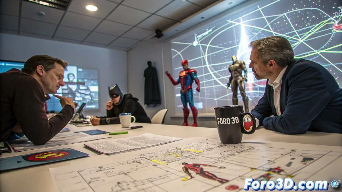
DC Cinematic Universe: When Universe Design Goes Wrong 🎭
Creating a cinematic universe isn't like making a salad - you can't just throw all the ingredients together and expect it to taste good. DC's previous attempt proved that even with the most iconic superheroes, without a clear structure you just get a confusing mess that leaves everyone wondering: "who invited this character?"
"It was like watching someone try to paint a mural with all the colors at once... and ending up with brown mud" - commented a fan while crying over his Justice League comic.
Design Lessons DC Ignored
Any graphic designer would have seen these problems coming:
- Visual Hierarchy: Not every character can be the protagonist at once
- Negative Space: Sometimes less is more (including superheroes)
- Stylistic Consistency: From depressing gray to vibrant color
- Clear Narrative: Cameos are not plot sustenance
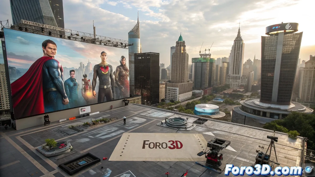
The Cinematic Toy Catalog
Instead of organic introductions, DC opted for:
- Launching characters as if they were collectible figurines
- Confusing cameos with character development
- Prioritizing quantity over quality
- Believing the audience would memorize 20 backstories simultaneously
The result was less "cohesive universe" and more "album of unglued stickers." 🏷️
DC's Emotional Color Palette
While Marvel played with the entire color wheel, DC seemed stuck on:
- 50 shades of gray (but without the romance)
- Dark blue with accents of... more dark blue
- Occasional touches of blood red
- Zero joy allowed
Conclusion: Less is More (Even with Superpowers)
The DCU reboot is an opportunity to apply the basic rules of good design: clear hierarchy, well-distributed spaces, and a palette that doesn't depress the viewer. Because in the end, even the best-built universes need a good architect, not just many bricks thrown at random.
And if everything fails again, they can always argue it was an alternate multiverse version... because in DC, that counts as planning. 😅