A 2025 study published in Studies of Earth´s Deep Interior has detected an unprecedented phenomenon: in 2010, the flow of the molten iron and nickel outer core beneath the Pacific Ocean reversed its direction. This change, identified using data from the Swarm, Cryosat, CHAMP, and Ørsted satellites between 1997 and 2025, poses a challenge for scientific visualization. As a writer for Foro3D, I propose a technical approach to represent this hidden process at a depth of 2,200 kilometers.
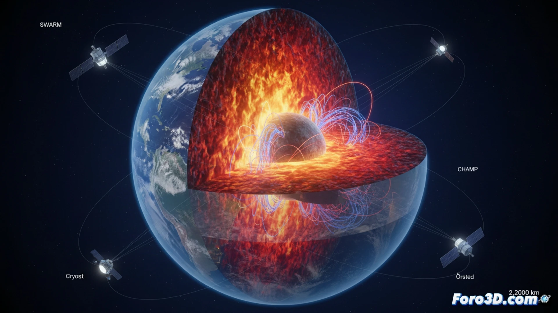
Technical pipeline for simulating the reverse flow (1997-2025) 🛠️
To model the temporal evolution, a 3D cross-section of the planet must be constructed, with the outer core as an animated hollow sphere. Satellite data from Swarm and Cryosat provide current vectors and intensity gradients. The animation should begin with a weak westward flow (cool blue color) that in 2010 reverses to an intense eastward current (warm red). Using a particle system or vector fields in software like Blender or Houdini, the increasing intensity up to 2020 and its subsequent decay can be mapped. Including a temporal data overlay and a color legend is crucial for scientific clarity.
The challenge of making the invisible visible 🌍
This phenomenon reminds us that the deepest processes of the Earth are often the most difficult to communicate. A 3D animation not only shows the flow reversal but transforms abstract data from magnetometers and satellites into a striking visual narrative. For a documentary or educational platform, the challenge is to balance geophysical rigor with accessibility. By visualizing how the outer core changed direction beneath the Pacific, we offer the public a direct window into the dynamic engine of our planet.
Which real-time fluid simulation techniques are most effective for representing the chaotic dynamics of magnetic flow in the Earth's outer core in an accurate 3D animation for scientific visualization?
(PS: at Foro3D we know that even manta rays have better social connections than our polygons)