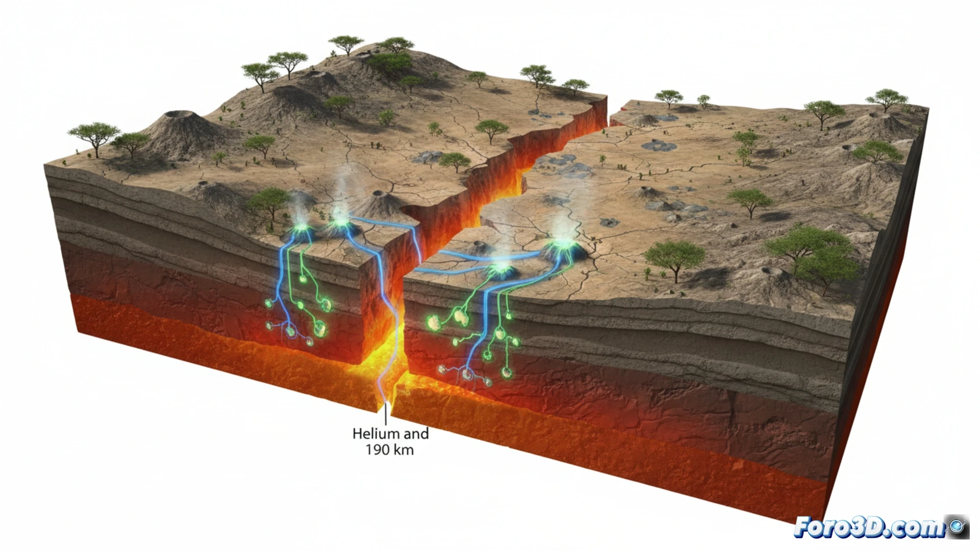
A team from the University of Oxford has discovered geochemical evidence of an incipient tectonic rupture in southern Africa. By analyzing helium and carbon gases in springs of the Kafue Rift, they detected isotopic signatures from the Earth's mantle at a depth of 190 kilometers. This geological finding, without active volcanoes or significant earthquakes, represents a unique opportunity to create 3D visualizations of a continental separation process in its earliest stages.
3D Modeling of Isotopic Data and Mantle Cross-Sections 🌍
To represent this phenomenon, we propose a 3D model of the rift system that integrates geospatial data from the eight sampling points (five springs and three geothermal wells) along the 2,500 kilometers of the Kafue Rift. The visualization should include mantle cross-sections showing the depth of the samples and the concentration of helium isotopes (up to 2.3% at the surface) and carbon. A time-lapse animation on a million-year scale could simulate the plate separation, while an interactive map would allow the user to explore the location of the springs and the chemical composition of their gases, highlighting the areas of greatest geothermal activity.
The Challenge of Visualizing an Invisible Geological Process 🧩
The main technical challenge is representing a process that occurs tens of kilometers deep and on geological time scales. There are no volcanoes or earthquakes to offer a direct visual spectacle. The solution lies in data abstraction: using color gradients to map helium concentration, animated particles to simulate the flow of gases from the mantle, and semi-transparent surfaces to show the incipient fracture of the lithosphere. This approach not only educates the public about plate tectonics but also demonstrates how 3D visualization can make the invisible tangible, from a helium molecule to the rupture of a continent.
What 3D visualization techniques do you recommend to effectively represent the geochemical subtlety of an incipient tectonic rupture like that of the Kafue Rift, avoiding visual saturation and highlighting critical data variations for scientific interpretation?
(PS: at Foro3D we know that even manta rays have better social bonds than our polygons)