Toshiyuki Kato is one of the silent driving forces behind David Production. His work on JoJo's Bizarre Adventure does not go unnoticed: where other directors seek visual balance, he prefers controlled chaos. With Diamond Is Unbreakable and Stone Ocean, Kato demonstrated that animation can be a narrative weapon when using colors that don't exist in reality and framing that makes the viewer uneasy.
Digital Expressionism: How Kato Breaks the Visual Standard 🎨
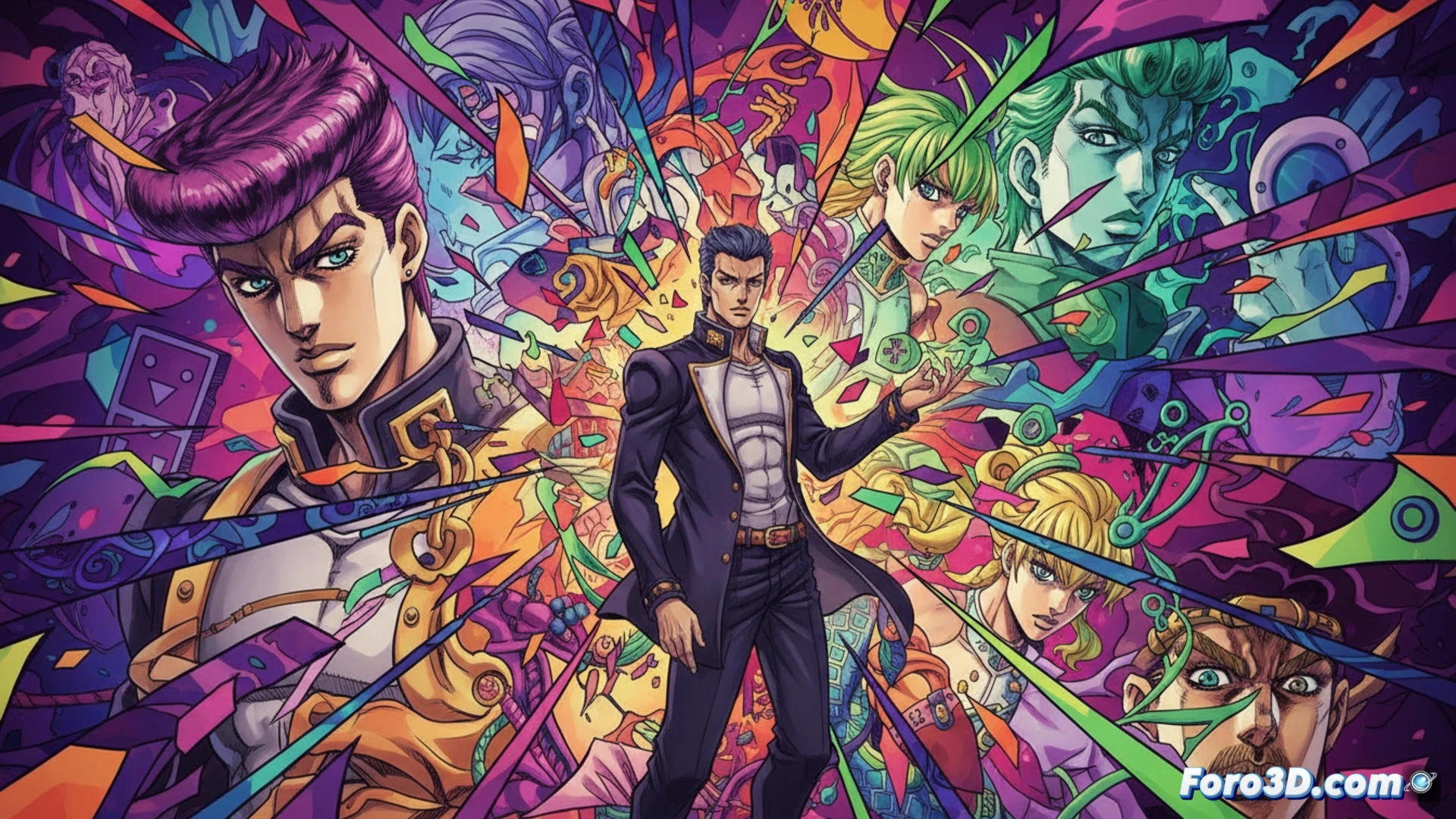
Technically, Kato applies selective color saturation reminiscent of German Expressionism, but with digital tools. In Stone Ocean, for example, the green and purple tones are not decorative: they generate a suffocating atmosphere that foreshadows danger. The camera angles, often tilted or high-angled, reinforce that sense of psychological instability. It's not a casual style: every chromatic choice responds to a character's emotional state. Kato doesn't seek to beautify the scene, but to make the viewer uncomfortable precisely when the plot demands it.
What if Kato Decorated Your Living Room? (Better Not) 🛋️
Imagine if Toshiyuki Kato went into interior design. You'd walk into your house and the walls would be toxic orange, the sofa at a 45-degree angle, and a lamp casting shadows that look like enemy Stands. You wouldn't be able to relax: every corner would scream that something is about to happen. Luckily, Kato stays at David Production, where his color palette only ruins the peace of mind of JoJo's characters, not yours.