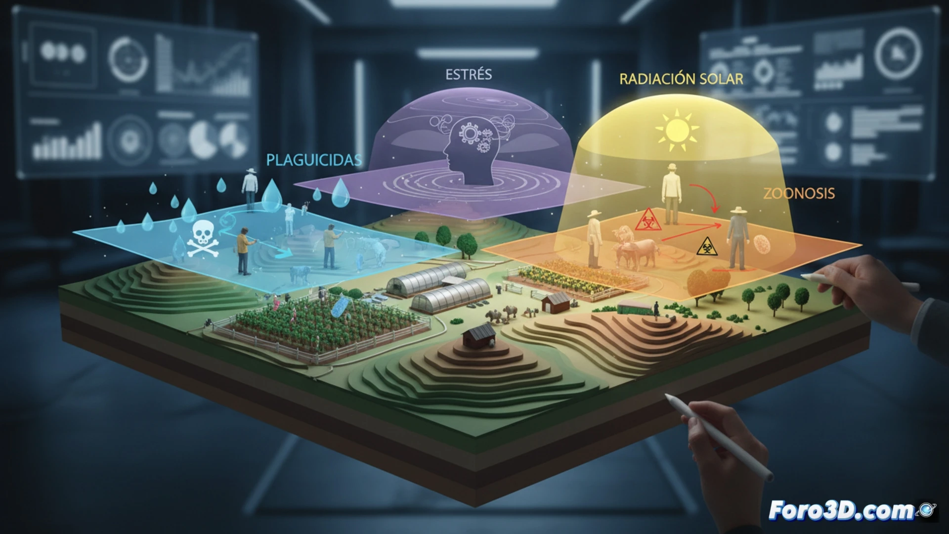
The work of an agricultural technician involves constant exposure to multiple risk factors that often go unnoticed in traditional reports. From handling pesticides in the field to managing animals with zoonotic potential, as well as long hours under solar radiation and the stress of harvest planning, this professional profile concentrates a high burden of hazards. Our proposal at Foro3D.com is to transform this data into an interactive 3D infographic that allows visualizing, layer by layer, the actual incidence of each risk.
3D visualization of epidemiological data and heat maps 🗺️
The infographic is structured into four main modules. The first is a heat map of solar and chemical exposure, where a silhouette of the technician shows the most affected body areas (hands, face, and respiratory tract) with color gradients indicating the frequency of contact. The second module models a zoonosis cycle in 3D, representing pathogens such as leptospira or brucella that are transmitted from animal to human, with particle animations. The third module is a three-dimensional bar chart comparing the level of stress from seasonal planning against other rural occupations. Finally, we include a panel of preventive recommendations visualized in 3D, such as the use of masks, protective goggles, and crop rotation to reduce the chemical load.
Visual prevention: the key to reducing silent accident rates 🛡️
The main advantage of this graphical representation is that it converts abstract data into immersive experiences. An agricultural technician can visually identify their own risk profile and compare it with that of other colleagues. Additionally, the inclusion of public health indicators, such as the rate of dermatitis from chemical exposure or the heat stroke index, allows prevention departments to design more effective campaigns. In a sector where training is often empirical, an interactive 3D infographic becomes a powerful pedagogical tool to save lives.
How could a 3D map of visual occupational hazards help prevent fatigue and accidents in agricultural technicians during prolonged field workdays?
(PS: public health graphs always show curves... like ours after Christmas)