The profession of beekeeping exposes workers to multiple risks, from handling hives to chemical exposure. However, the most critical threat is massive stings and severe allergic reactions. In this article, we propose a visual epidemiological analysis using interactive 3D infographics, capable of simulating the spread of allergies and the effectiveness of emergency protocols in real time.
3D Modeling of Incidence and Immune Response 🐝
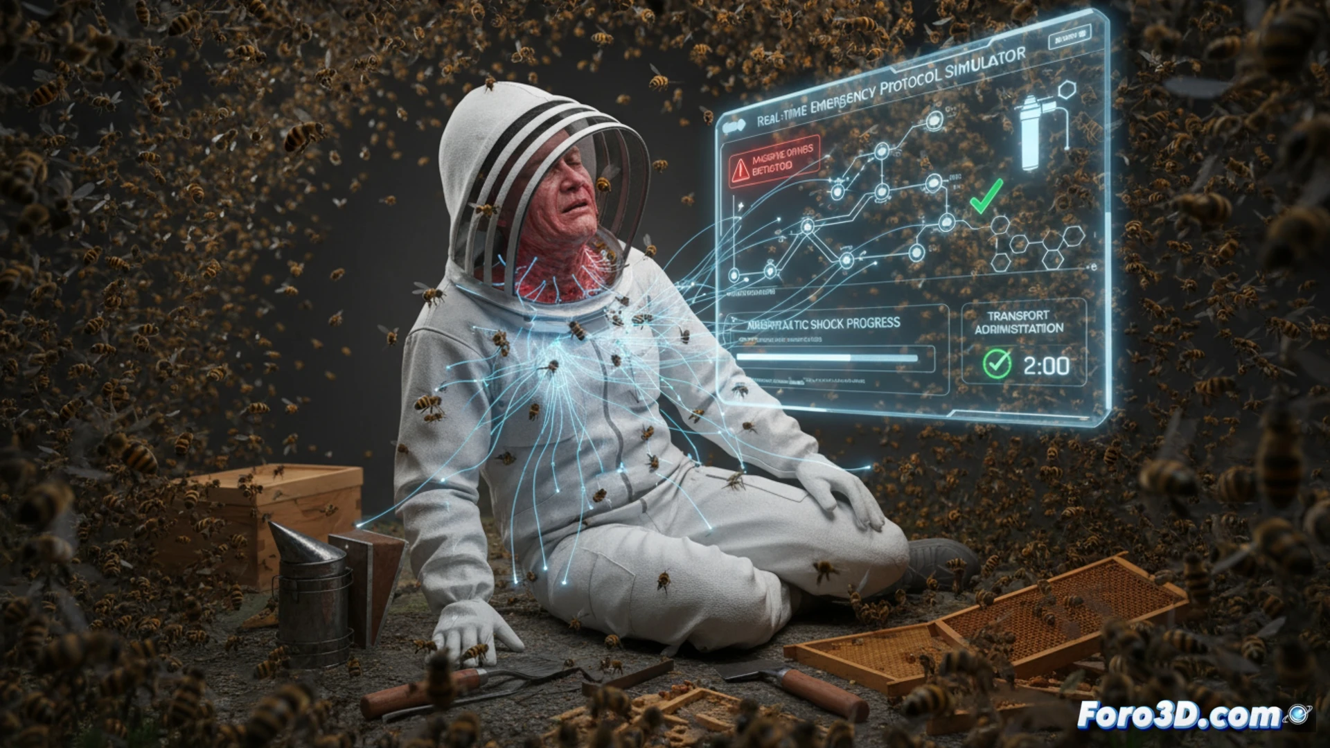
The proposed infographic integrates dynamic heat maps showing the incidence of massive stings by region, correlating them with access to medical services. Through a 3D anatomical model of the immune system, the cascade of events during an anaphylactic reaction is visualized: from histamine release to shock. This approach allows beekeepers and occupational health officials to identify high-risk areas and evaluate the effectiveness of protocols such as epinephrine administration. The simulation includes variables such as hive density, climate, and proximity to health centers.
Visual Prevention: Beyond the Data 🛡️
Visual epidemiology not only shows numbers but humanizes risk. By representing in 3D the allergic response and physical stress from heavy loads, awareness is raised about the importance of protective equipment and emergency plans. This educational tool transforms cold data into an immersive experience, helping to prevent tragedies and design more effective public health policies for a vital yet vulnerable labor sector.
How would you represent in 3D the incidence of obesity by geographic regions?