The profession of a flight attendant hides invisible risks. Beyond turbulence and coffee burns, chronic exposure to cosmic radiation and circadian desynchronization create a unique epidemiological profile. We analyze how 3D visualization can transform this data into preventive tools for occupational public health.
Visualization methodology: Cumulative incidence and predictive models 📊
To build an interactive 3D infographic, variables such as flight hours on polar routes (high radiation), number of weekly time zone changes, and biomechanical records of luggage handling must be cross-referenced. The proposed model uses georeferenced heat maps for radiation and temporal fatigue charts. Musculoskeletal simulations show joint degeneration at 10 and 20 years of service, allowing comparison of the incidence of lower back pain with that of professions such as construction or nursing.
From the cabin to the map: The biological cost of flying ✈️
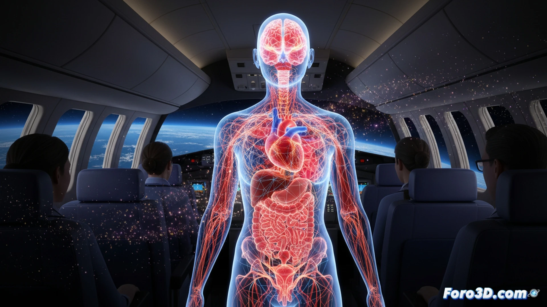
Visual public health requires that this data cease to be static reports. A 3D infographic can reveal that a flight attendant on transoceanic routes accumulates, over 15 years, a radiation dose equivalent to 500 chest X-rays. Visualizing this risk, along with stress and fatigue, not only raises awareness among the group but also allows epidemiologists to design more stringent and personalized route rotation policies and flight hour limits.
How can 3D mapping of cosmic radiation exposure in aircraft cabins reveal patterns of chronic visual fatigue undetected by traditional epidemiology in flight attendants?
(PS: modeling health data is like dieting: you start with energy and end up giving up)