The promise of owning a fraction of a Monet or a Patek Philippe sounds enticing, but numerical analysis reveals a very different reality. At Foro3D, we have designed an interactive financial visualization that breaks down the cash flow of these assets. The model shows how an initial investment of 10,000 euros is eroded by annual management fees of 2% to 4%, leaving a residual value that rarely exceeds 60% of the original outlay after five years.
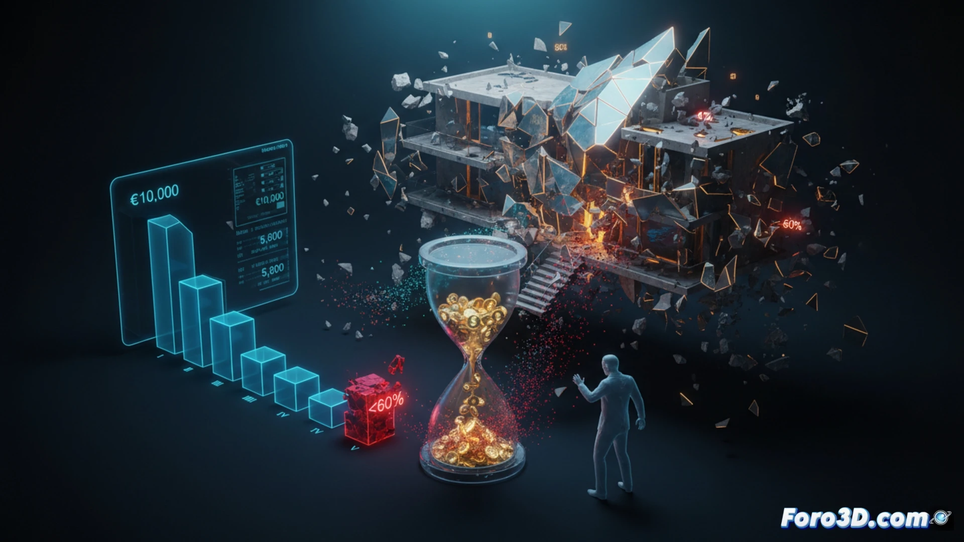
3D Visualization of Capital Flow and the Liquidity Trap 📉
Our three-dimensional infographic models three scenarios: optimistic (asset appreciation of 5% annually), realistic (stagnation), and pessimistic (10% decline). Each scenario projects a stacked bar chart where the red color represents fees devouring the capital, and blue represents the value of the fraction. The critical data point is the lack of a robust secondary market: when attempting to sell, the model shows a forced discount of 30% to 50% on the book value, creating a visual hole we call the unrecoverable value trap. Compared to an index fund (solid green line) or a government bond (orange line), the luxury fraction appears as an initial peak that fades into a descending plateau.
The Paradox of Shared Luxury: Ownership Without Control 🔍
The visualization reveals a fundamental irony: you own a part of a unique object, but you lack any power over its custody, sale, or exhibition. Fees not only reduce the return but turn the investment into a sinkhole of fixed costs. Our interactive simulation allows the user to adjust the management costs slider to see how, in any scenario above 2.5% annually, the investment enters guaranteed losses by year seven. Luxury, in this format, is not an asset, but an expensive subscription service with a bonus of illusion.
As a 3D financial visualization analyst, what numerical parameters and spatial simulation models do you consider key to representing the illusion of liquidity in a fraction of a luxury asset, and how is that representation distorted when confronted with real secondary market data?
(PS: at Foro3D we know that the only interest that is sure to rise is that of our electricity bills)