The promise of a completely free photovoltaic installation, 100% financed by grants, sounds tempting. But behind the slogan Zero Fee lies a high-risk financial product. The user signs a contract assigning collection rights, linked to a public subsidy that may take years to materialize or be directly denied. Meanwhile, a bank grants a loan to the installer, the cost of which falls on the client through monthly installments camouflaged under the concept of guaranteed energy savings.
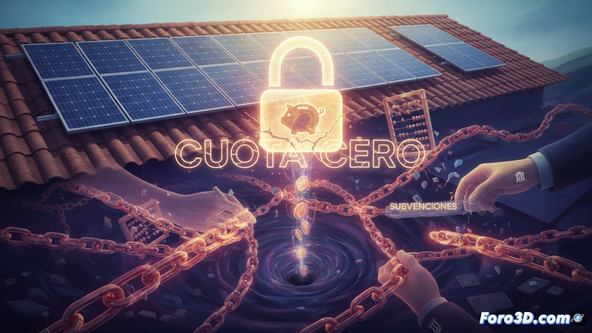
3D visualization of the financial flow: phantom subsidy vs. real loan 🏦
To dismantle this model, we propose an interactive 3D infographic that models the system as a graph of nodes and edges. The first node represents the promised subsidy, with a semi-transparent texture that fades over time to symbolize its uncertainty. The second node is the bank loan, modeled as an intense red cylinder that grows in height as interest accumulates. An animated timeline will show how energy savings (represented as a decreasing green bar) are systematically surpassed by the loan installment (ascending red bar) during the first 5 to 7 years. The actual break-even point is marked with a transparent cutting plane that is only reached if the subsidy is collected in the first year.
The business model of opacity 🔍
The trap lies in the asymmetry of information. The installer obtains immediate liquidity through the assignment of the credit, while the user assumes an interest rate and term risk that is not detailed in the fine print. The 3D simulation should include a comparative mode: on the left side, a Zero Fee scenario with a growing mountain of debt; on the right, a direct purchase scenario with a conventional green loan, where energy savings do accumulate. The user can rotate the scene and click on each node to see the breakdown of interest, fees, and the total hidden cost. This visualization turns an abstract concept into a geometric reality impossible to ignore.
As a 3D visualization professional, what modeling and animation techniques do you recommend to clearly and non-deceptively represent the flow of hidden costs and accumulated debt in a zero-fee photovoltaic installation?
(PS: visualizing your money in 3D won't make you have more, but at least it will seem more impressive)