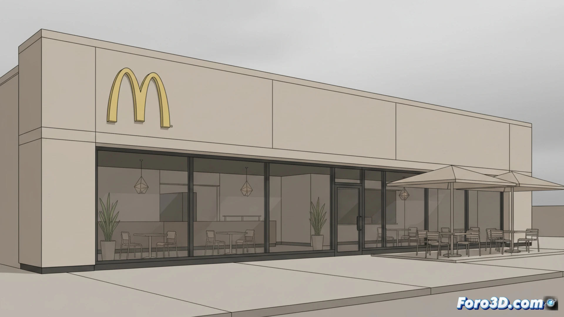
The world's most famous fast-food chain has left behind vibrant colors, clown characters, and children's play areas. Since the 2000s, McDonald's opted for a minimalist and corporate design, seeking to compete with Starbucks and attract adults with laptops. The result: restaurants that look like bank waiting rooms, losing the spark that made them unique.
The Nostalgia Algorithm: How AI Optimized Fun 🤖
The change was no coincidence. McDonald's applied data analysis to segment its customers, identifying that adults between 25 and 40 spend more on coffee than on Happy Meals. Thus, they redesigned their locations with materials like dark wood, dim lighting, and digital menus. Play areas were replaced by USB charging stations. Pedestrian traffic management software determined that a serious atmosphere speeds up table turnover, increasing sales per hour by 12%.
How to Sell a Burger Without Looking Like an Amusement Park 🍔
Now you walk into a McDonald's and it feels like you're about to sign a mortgage, not eat a Big Mac. Employees no longer smile; they just look at you with a you have 5 minutes to order face. They even painted the golden arches matte gray. Soon they'll install massage chairs and sell memberships. Next time you go, don't be surprised if they offer you an almond milk latte and a brochure on investment funds.