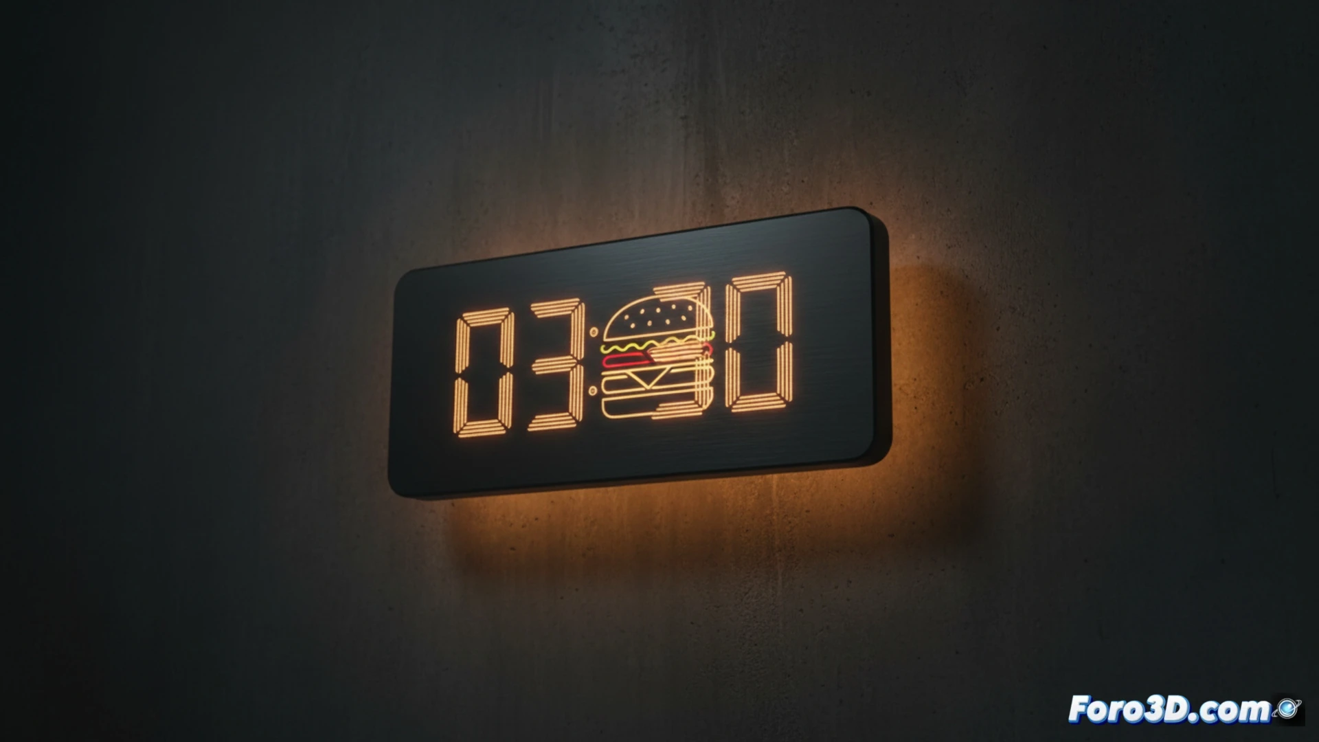
McDonald's has once again demonstrated its dominance in print advertising with a 2018 campaign that resurfaces on social media and Reddit. Created by Leo Burnett Germany, the McClocks series promotes its 24-hour restaurants. The ads simulate the interface of a digital clock, but the minute marks hide silhouettes of products like the Big Mac or the Filet-O-Fish, recognizable by their contours. The campaign tops the r/DesignPorn channel with over 5,400 upvotes, showing how the brand's iconography is recognized with just a few lines.
An exercise in visual identity with just a few strokes 🎨
From a technical perspective, the McClocks campaign exploits pattern recognition and the consumer's visual memory. Each digital clock is made up of lines that form the digits of the time, but by replacing segments with products like the hamburger or the ice cream, a controlled ambiguity is generated. The human eye completes the missing information, activating the direct association with the brand. This approach, similar to the use of fragments of the golden arches, demonstrates that McDonald's identity is so strong that it works even with minimal representations and without color.
When a clock reminds you it's time for a Big Mac 🍔
The curious thing about McClocks is that, instead of looking at the time, you end up calculating how long until your next craving. Because, let's be honest, if you see 3:47 and only identify a Filet-O-Fish in the minutes, your brain has already decided that dinner will be at McDonald's. The campaign is so effective that more than one person has probably arrived at the restaurant asking for the 4:20 menu, only to discover that the clock didn't indicate that. Next time you look at a digital clock, check twice: maybe it's not 12:00, but an invitation to a McFlurry.