Bungie has yielded to complaints from a group of players and has modified the implant icons in Marathon. The decision aims to improve visual clarity but eliminates the abstract style that defined the game's identity. The result is a generic design that dilutes the diegetic narrative of the universe.
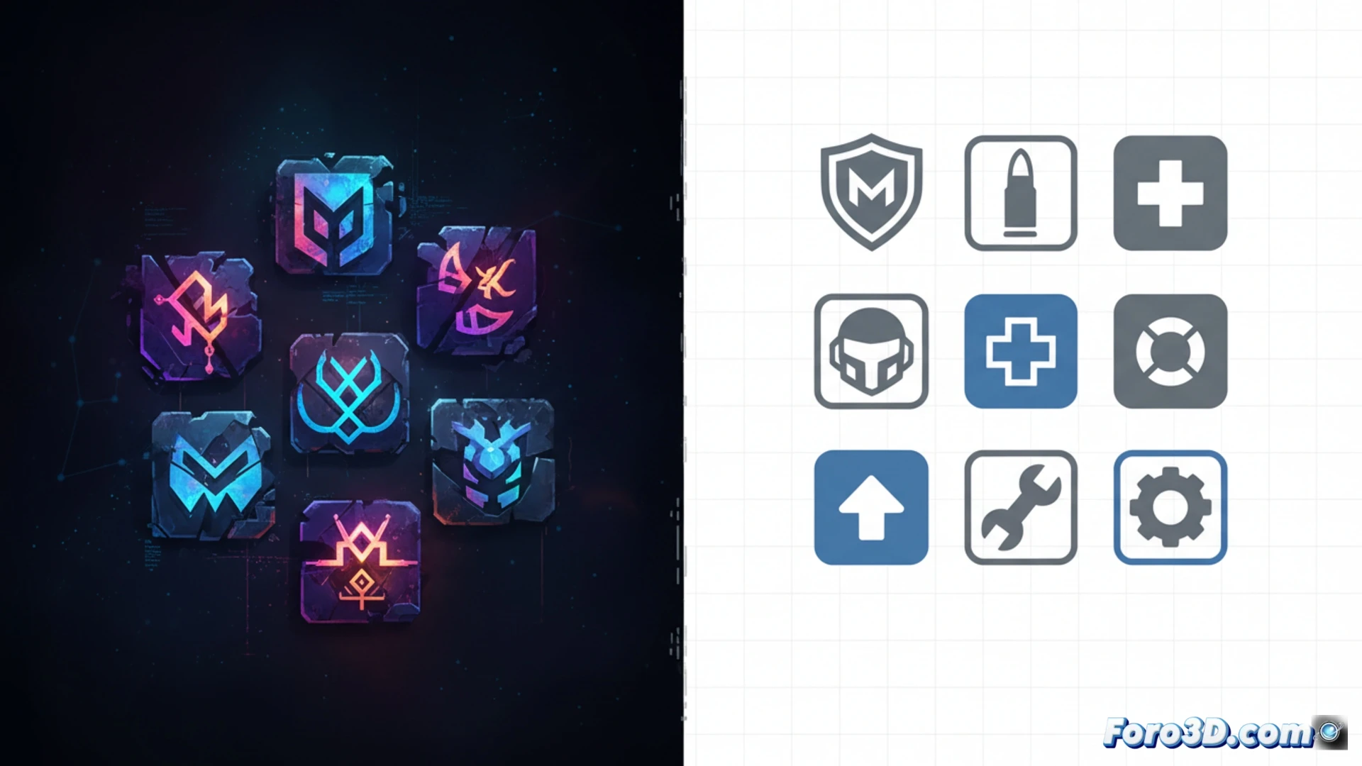
A patch that breaks the game's visual coherence 🛠️
The new icons replace cryptic and organic shapes with flat, standardized symbols. Although it is argued that they facilitate quick reading, in practice they generate confusion by disconnecting from the narrative context. Marathon builds its story through visual elements that demand the player's attention; by simplifying them, key information about the lore and function of each implant is lost. Readability does not improve; it only becomes more bland.
Now the implants are as clear as an Ikea manual 🪑
Good thing the new icons are so intuitive that anyone can understand them without reading the help text. Because nothing screams deep science fiction like a little drawing of a syringe and a smiling brain. Next step: change the weapons to emojis so no one has to make an effort. After all, the charm of Marathon was not having to think, right? 😅