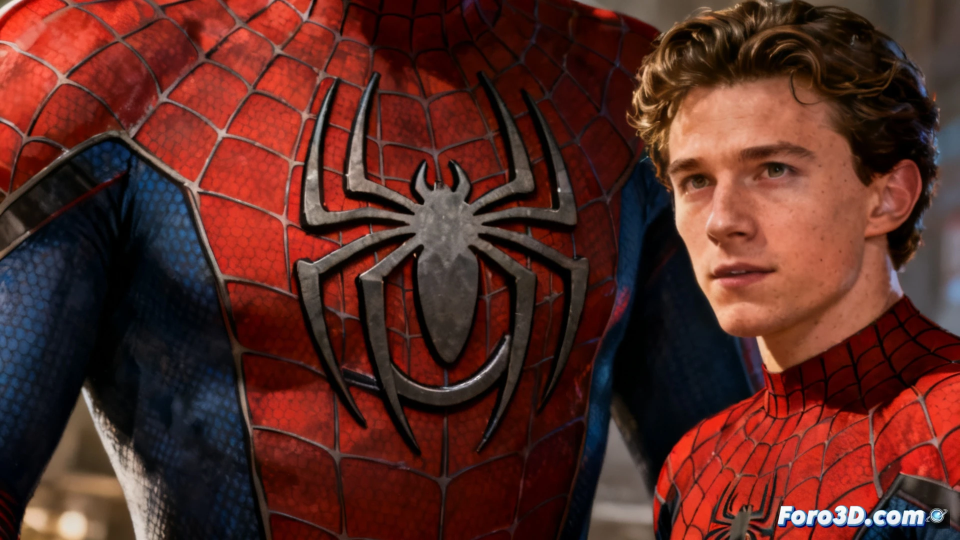
The new Spider-Man logo on the Brand New Day posters has sparked a debate among wall-crawler fans. Although the image shows Tom Holland without a mask, the focus is on the spider on the suit: the upper legs of the logo appear to connect to each other, forming a closed loop that breaks with the classic arachnid silhouette.
Leg fusion: a render error or a conceptual decision 🕷️
Marvel Studios designers have chosen to unify the spider's upper legs into a single black mass, eliminating the traditional separation. This technical decision could be due to a simplification of the 3D model to facilitate digital animation or an intentional redesign of the suit. In any case, the visual result creates a spider with a more organic and less detailed appearance, moving away from Steve Ditko's iconic design.
Does the spider need a diet now, or is it just a hug? 🕸️
It seems the spider on the suit decided to feast on its own legs and now looks more like an inkblot than an arachnid. Fans are already speculating: is it a printing error, or did Peter Parker ask for a more hug-friendly logo? The truth is, if the spider keeps this up, it will soon be a perfect circle and we'll have to call it Spider-Circle.