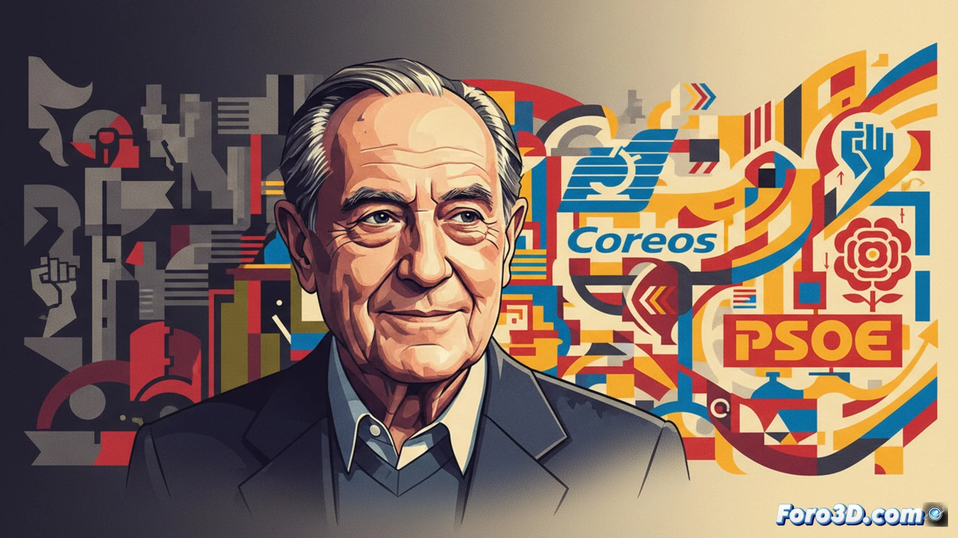
Designer José María Cruz Novillo has passed away at the age of 89, leaving a visual legacy that marked the Spanish Transition. From the Correos logo to that of the PSOE, his clean, geometric strokes symbolized the shift from dictatorship to democracy. His work offered a renewed identity for a country seeking to modernize, moving away from the symbols of the past and embracing a functional, recognizable aesthetic.
The technology of the stroke: from brush to vector 🖌️
Cruz Novillo worked in an era where graphic design depended on manual dexterity and the precision of the marker, not touchscreens. His method combined scale models, analog photography, and mathematical grids to achieve perfect symmetry. Each logo was an exercise in visual synthesis, where a single line had to communicate an entire institution. Today, his designs are redrawn in vector software, but the conceptual basis remains the same: clarity, balance, and the absence of visual noise.
When a logo weighed more than a political speech 💬
They say that in the 80s, some politician asked if the circle in the PSOE logo was a sun or a wheel. Cruz Novillo, with the patience of a secular saint, replied that it was a geometric shape. The best part is that the logo survived debates more heated than those of the investiture. While politicians argued, the design remained, unmoved, proving that a good corporate image can have more stability than a government. May the man who brought visual order to political chaos rest in peace.