On May 11, a food poisoning outbreak affected around 200 students in the Tembok Dukuh subdistrict, Surabaya, Indonesia. Spread across 12 kindergartens, elementary, and middle schools, the children experienced dizziness, nausea, and vomiting after consuming free meals from a state program. Although none required hospitalization, the incident triggered an epidemiological investigation pointing to a meat dish as the possible source of contamination.
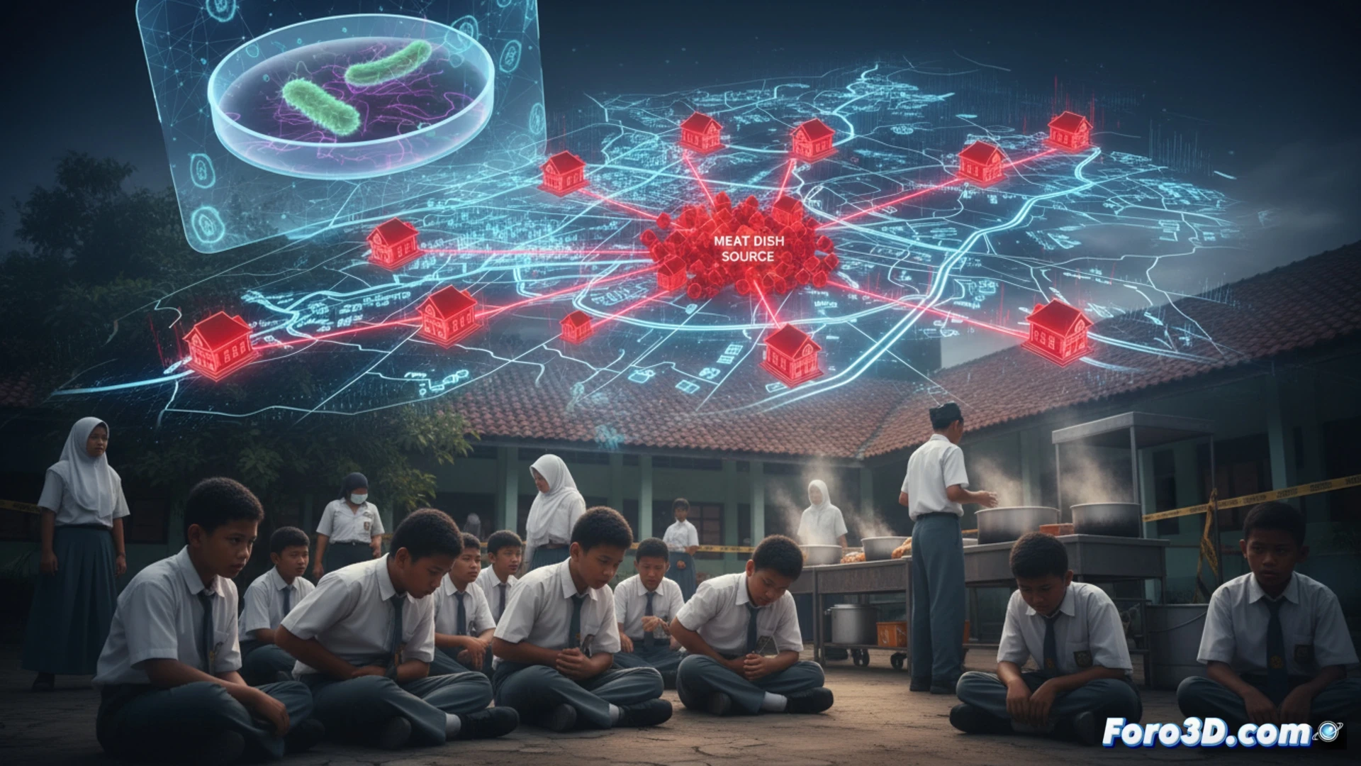
Epidemiological visualization: Modeling the distribution chain 🗺️
To understand the dynamics of the outbreak, we propose an interactive 3D map of the subdistrict locating the 12 affected schools. The model should include the distribution route from the nutrition service unit to each institution, highlighting the critical point where the suspected meat was prepared and dispatched. Over the schools, 3D bar charts can be overlaid representing the number of cases per campus, differentiating symptoms such as dizziness (blue), nausea (yellow), and vomiting (red). An animated timeline would show the progression of symptoms from ingestion to medical care, allowing users to explore the speed of spread within the school environment.
The dish in question: Reconstruction of the contamination source 🥩
The central element of this visualization is a detailed 3D model of the suspected meat dish, described by students as having a bitter taste. By rotating and zooming in on the model, the area of possible bacterial or chemical contamination can be labeled, based on samples sent to the health laboratory. This resource not only illustrates the critical point of the outbreak but also serves as an educational tool to identify risk factors in food handling, reinforcing the importance of traceability in mass feeding programs.
As
(PS: 3D incidence maps look so good they almost make being sick enjoyable)