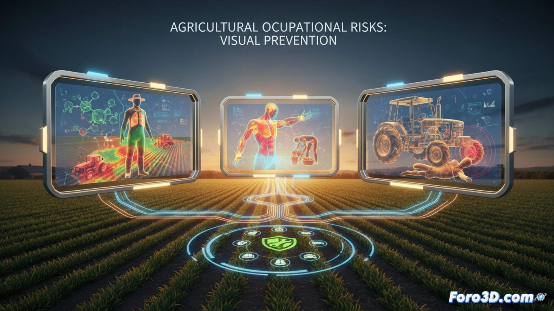
Agriculture is one of the sectors with the highest rate of occupational accidents. Field workers face a lethal combination of factors daily: chemical exposure, repetitive physical strain, and heavy machinery. To address this issue from a Public Health perspective, we propose an interactive 3D infographic that transforms epidemiological data into visual models. This tool allows prevention professionals to identify critical points through heat maps of phytosanitary products and accident simulations, facilitating decision-making in the field.
Anatomical Modeling and Accident Simulation 🚜
The infographic includes three-dimensional anatomical models representing the most common musculoskeletal injuries: lower back pain from excessive load and tendinitis from repetitive movements. Through animations, incorrect biomechanics when lifting crops are visualized. Additionally, simulations of tractor rollovers and entrapment in harvesters are integrated, based on real statistics from the Ministry of Labor. Seasonal incidence graphs reveal accident peaks during planting and harvesting seasons, correlated with adverse weather conditions such as heatwaves or torrential rains. This dynamic representation allows prevention technicians to adjust protocols according to the season.
Preventive Visualization for an Invisible Sector 🌾
Visual epidemiology not only shows the problem but also offers solutions. By overlaying heat maps of pesticide exposure with wind and humidity data, the farmer can plan safe applications. The infographic incorporates practical recommendations: use of FFP3 masks, active break schedules, and technical machinery inspections. By making the invisible visible (dust, allergens, soil pathogens), this tool educates and prevents. In a trade where risk is constant, 3D visualization becomes an ally to reduce accident rates and protect the visual and physical health of rural workers.
How can the 3D infographic transform the perception of occupational risks in farmers to reduce visual accident rates in the sector?
(PS: the 3D incidence maps look so good that they almost make being sick enjoyable)