The outbreak on the MV Hondius cruise ship in 2026, with three fatalities and multiple infections, has reignited the debate on the transmission of Andes hantavirus. Unlike COVID-19, this pathogen does not spread through common aerosols, but only through direct contact or fluids. Analyzing its contagion dynamics allows for the design of visual predictive models that save lives.
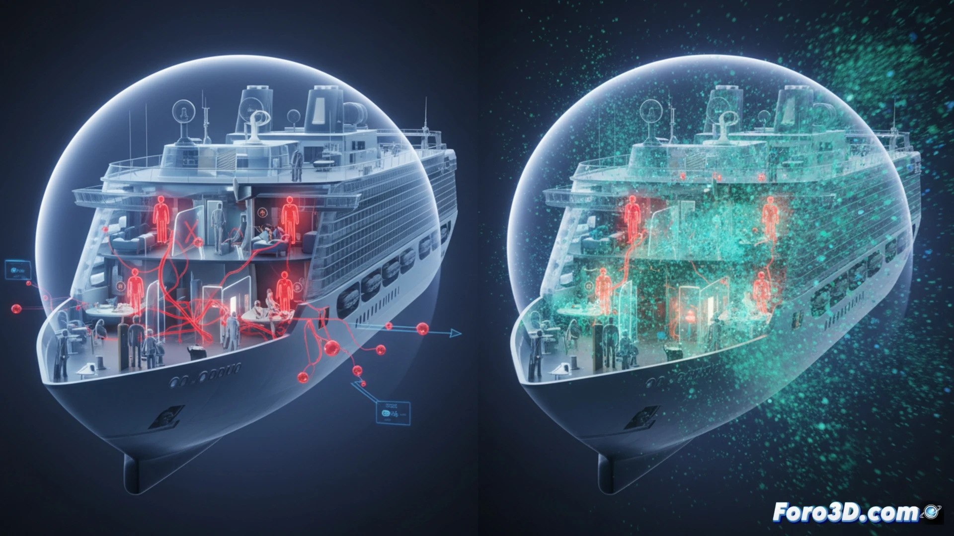
Transmission dynamics and comparative predictive model 🧬
Our proposed interactive 3D infographic focuses on two axes. First, a visual comparison of the reproduction rate (R0) of Andes hantavirus versus SARS-CoV-2, highlighting that the former requires much closer contact to spread. Second, a heat map of the 2018-2019 Argentine outbreak, where official data showed that the transmission speed was halved after imposing quarantines. The MV Hondius simulation incorporates a time slider to observe how physical distancing, implemented after the virus was confirmed, stopped the chain of infections in the ship's enclosed space.
Epidemiological lessons for interface design 📊
Visualizing the slowness of hantavirus compared to the speed of COVID-19 changes the perception of risk. It is not about alarmism, but about precision. A 3D interface showing how a single isolation measure cuts transmission by 50% educates better than a thousand bar charts. This approach reinforces that, for pathogens with low transmissibility, targeted interventions are more effective than mass lockdowns.
How would you create an interactive map that shows data by age group and sex? 🗺️