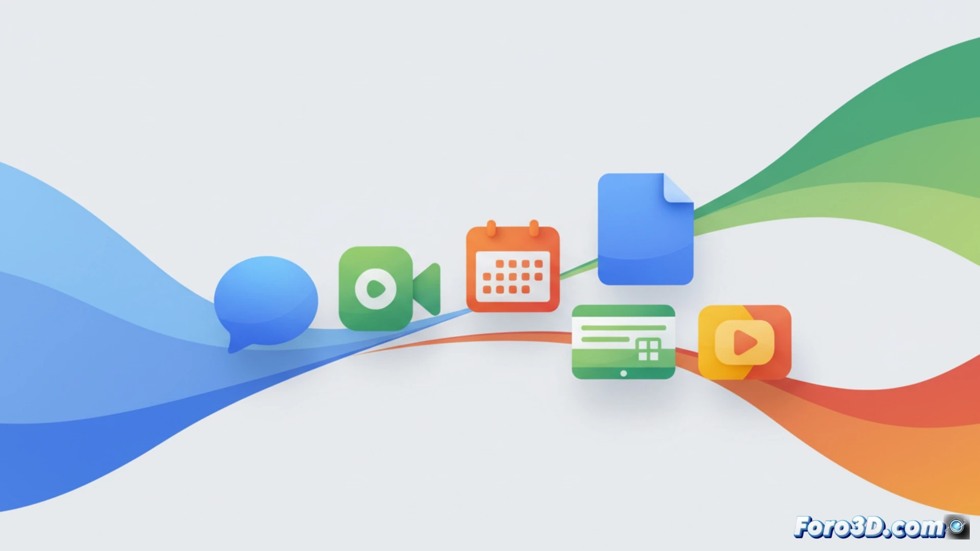
Google has begun rolling out redesigned icons for its Workspace applications, featuring smooth color gradients, rounded corners, and refreshed shapes. Users will notice a transition from light to dark tones, similar to the Google logo launched a year ago. Apps like Chat, Meet, and Calendar are moving from a multicolor design to a single tone, while Docs, Sheets, and Slides maintain familiar colors, although Sheets and Slides are now displayed in horizontal mode.
Technical changes in Workspace's visual identity 🎨
The update unifies the icon family under a coherent design system, applying linear gradients that evoke the color palette of the main logo. Chat, Meet, and Calendar icons adopt single tones to simplify visual identification. Sheets and Slides, previously in vertical format, are now aligned horizontally, following the orientation of Docs and other products. This standardization aims to reduce the user's cognitive load, although it implies a notable change in the arrangement of elements that had remained unchanged for years.
The day Google decided color was too much 😅
Google has looked at its apps and said: too much color, let's simplify. So Chat, Meet, and Calendar have lost their multicolor personality to dress in a single tone, as if they were going to a formal wedding. Meanwhile, Sheets and Slides have decided to lie down, switching from vertical to horizontal without notice. Next up, Gmail might adopt a single blue tone and the send button might disappear for minimalism. Innovation, they call it.