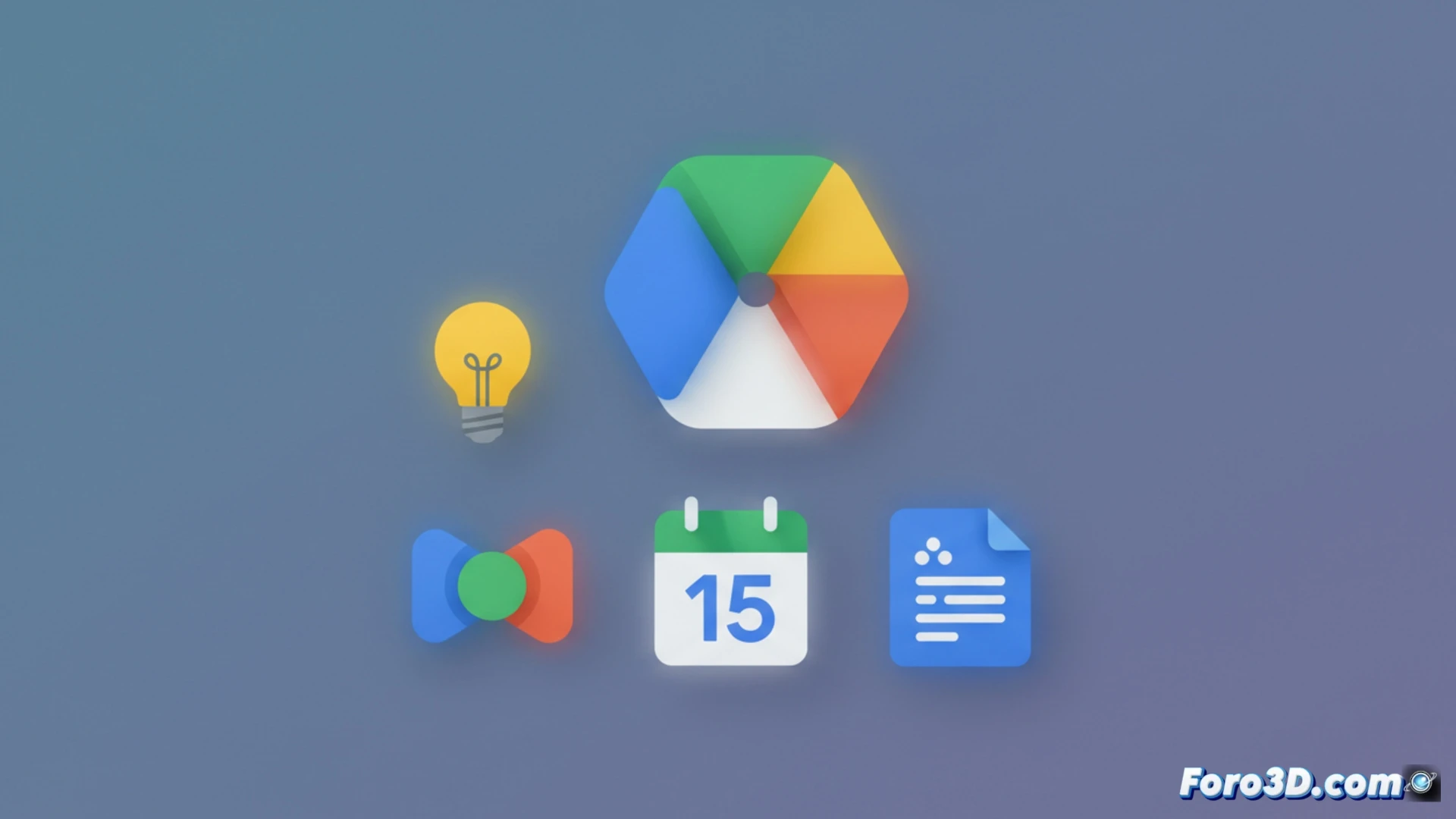
Google has updated the icons of its Workspace suite just before the I/O conference. Drive loses its classic red dot and gains rounded corners, while Keep is simplified to a yellow bulb without a border. Gmail maintains a cleaner look without drastic changes. The transition to flat tones seeks uniformity, although some users might have difficulty recognizing the apps at a glance.
Visual simplification with impact on app identification 🎨
The redesign bets on single-tone icons and more geometric shapes, eliminating shadows and superfluous details. In Drive, the removal of the red dot aims to align the icon with the rest of the Material Design 3 ecosystem. In Keep, the borderless bulb reduces visual contrast. These technical decisions respond to a strategy of visual coherence, but reduce differentiation between services, which could slow down the location of applications on screens with many icons.
Keep is now just a bulb: minimalism without limits 💡
Google has decided that Keep needed less personality. Now it's a yellow bulb floating in the void, without a border or context. Perfect for those who always dreamed of an app that blends into the wallpaper. If you used to confuse it with the mobile flashlight, now it directly looks like a lost emoji. But don't worry, surely in the next update they'll reduce it to a yellow dot. For that we already have Drive without a red dot.