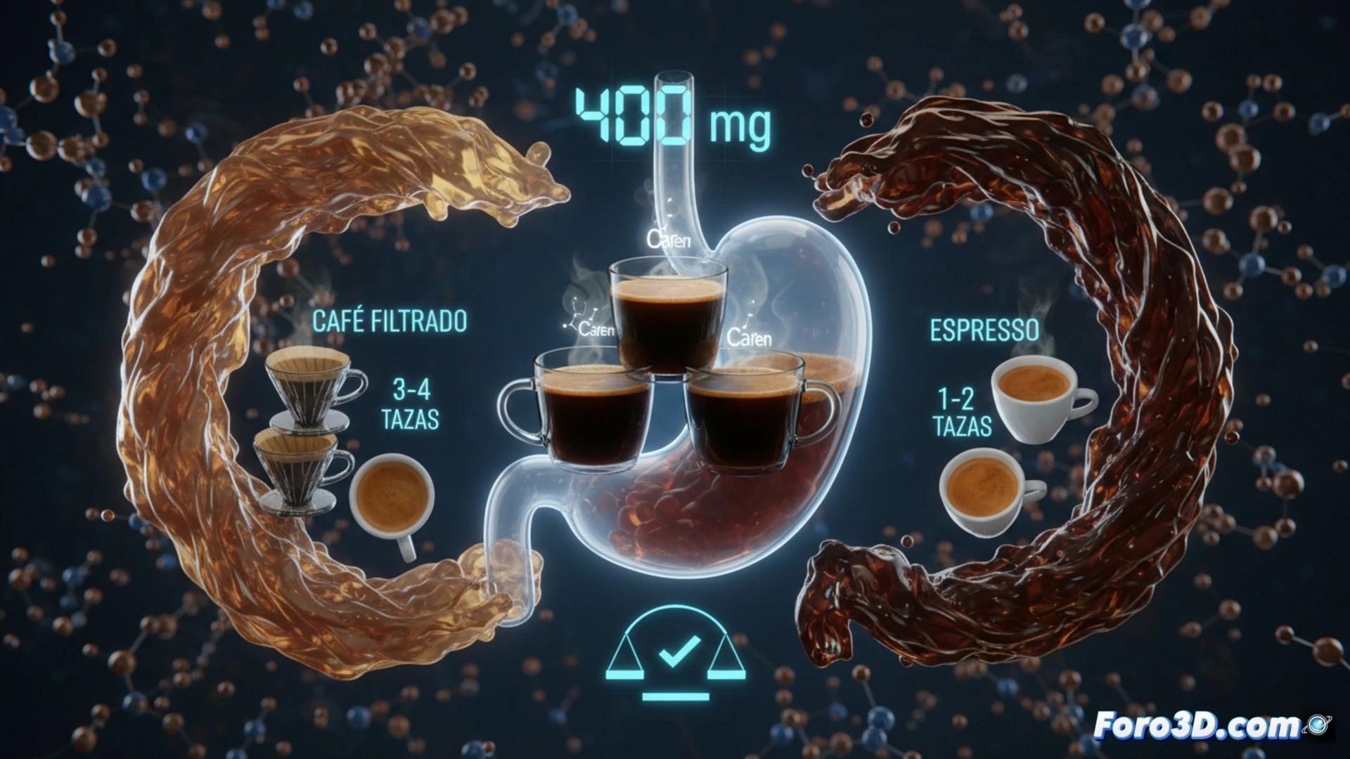
Science is clear: the FDA and EFSA set the daily caffeine limit for healthy adults at 400 milligrams. But how can you visualize this number in your routine? An espresso is not the same as a filtered coffee. For a technical writer at Foro3D, this challenge translates into modeling caffeine variability. An interactive 3D infographic allows breaking down this limit, showing that it is roughly equivalent to 3 or 4 standard cups of filtered coffee, and helps debunk alarmism about serious organic damage.
Variable Modeling: Extraction and Dosage in 3D Environments ☕
For an accurate simulation, we must parameterize caffeine content based on the extraction method. An espresso (30-50 ml) provides between 60 and 80 mg of caffeine, while a cup of filtered coffee (240 ml) contains between 95 and 200 mg. Instant coffee, on the other hand, ranges around 60-80 mg per serving. In our 3D model, each cup is represented as a polygonal volume that lights up as it accumulates. When exceeding 4 cups of filtered coffee (approximately 400 mg), the associated anatomical model activates visual alerts: a simplified nervous system that flashes to simulate jitteriness, or a heart that accelerates its pulse to represent palpitations. This educational approach allows the user to drag and drop different types of coffee to see how the 400 mg indicator fills up in real time.
The Key Lies in the Layer of Moderation 🧠
The goal is not to demonize coffee, but to educate about its responsible consumption. Our 3D model does not show irreversible organic damage, as science confirms that exceeding the limit causes transient effects like insomnia or intestinal irritation, not serious pathologies. By visualizing caffeine accumulation, the user understands that moderation is the critical variable. This tool is ideal for health apps and 3D nutrition campaigns, where visual interaction replaces plain text, offering an immersive experience that reinforces healthy habits without falling into alarmism.
How would you visually represent the difference between healthy nutrients and ultra-processed foods?