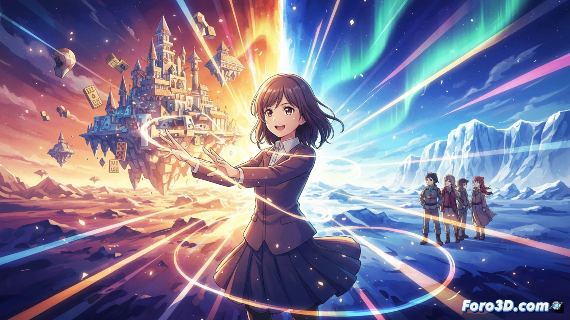
Atsuko Ishizuka is one of Madhouse's young directors with a career path different from the usual. Her background in graphic design, rather than traditional animation, gives her works a visual identity marked by color and light. With series like No Game No Life or Sora yori mo Tooi Basho, she has built a style that combines vibrant aesthetics with stories of discovery and great ambitions. Her fresh perspective positions her as a relevant figure within the studio.
How Graphic Design Shapes Her Animation 🎨
Ishizuka's foundation in graphic design is evident in her use of flat compositions, saturation contrasts, and almost commercial lighting. In No Game No Life, the backgrounds resemble digital illustrations with layers of pure color, while in Sora yori mo Tooi Basho, natural light becomes another character. This technique reduces realistic detail to prioritize visual impact. Additionally, her handling of the virtual camera allows for smooth transitions that reinforce the narrative rhythm without relying on complex traditional animation movements.
When Color Hits You in the Face (And You Like It) 💥
Watching an Ishizuka series is like getting a neon punch straight to the eyes. Her saturated palette would make an academic painter cry, but it works because the stories of dreamy teenagers demand it. In Drifting Home, characters float in a sea of impossible tones while resolving their dramas. Exaggerated? Yes. Beautiful? Also yes. In the end, you accept that the real world will never have those filters and are left longing to live in her frames.