In digital art, a wrong stroke or an abstract color blotch can become the starting point of a solid composition. An article from ImagineFX explores how these accidents, far from being failures, act as creative guides. By reinterpreting chaotic shapes as clouds, rocks, or human figures, the illustrator finds a visual balance that was not planned, transforming the error into a highly valuable compositional resource.
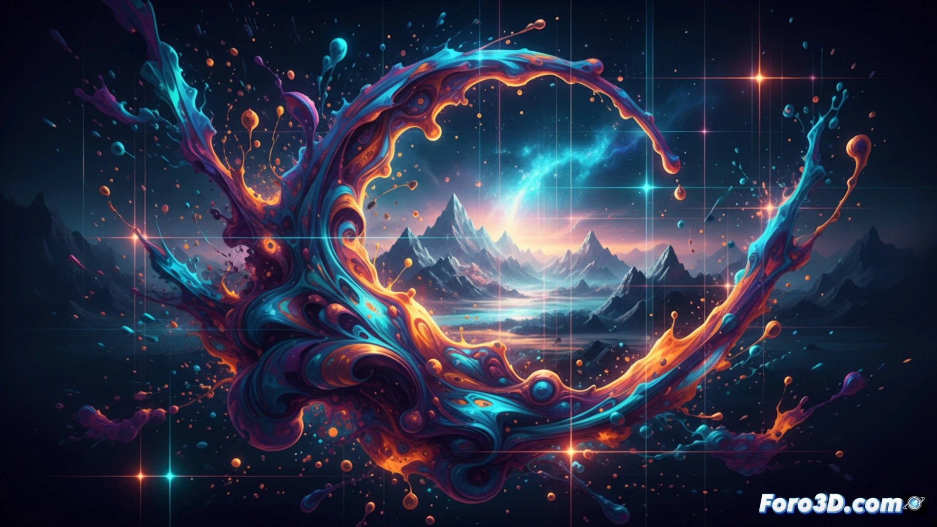
How to Integrate Chaos into Your Digital Workflow 🎨
To apply this approach, the article suggests working with random color layers using rough texture brushes or blur filters. By reducing opacity and overlapping shapes, the human eye seeks recognizable patterns. The trick is not to erase immediately: adjust the contrast, scale, or rotate the accident until it fits into the scene. Tools like free transform or color range selection allow you to isolate and reuse those blotches as a base for shadows, backgrounds, or organic details.
The Mistake That Will Make You Look Like a Genius (Without Deserving It) 😏
The best part is that no one has to know that epic cloud background was born from a smudge you made when you sneezed on the tablet. You take the credit, your client thinks you planned it all, and the accident stays quiet. So now you know: if something goes wrong, flip it, put a filter on it, and call it style. Next time you spill coffee on the sketch, don't cry. You could be looking at your next masterpiece.