While the wholesale electricity price fluctuates in interconnected European markets, the final bill paid by households diverges dramatically between countries. A comparison between Spain and nations like Luxembourg, Ireland, or the Netherlands reveals that the key is not in generation, but in fiscal policy. This analysis proposes a 3D visualization to break down and compare each component of the bill, making tangible the impact of taxes, tolls, and subsidies on the final cost.
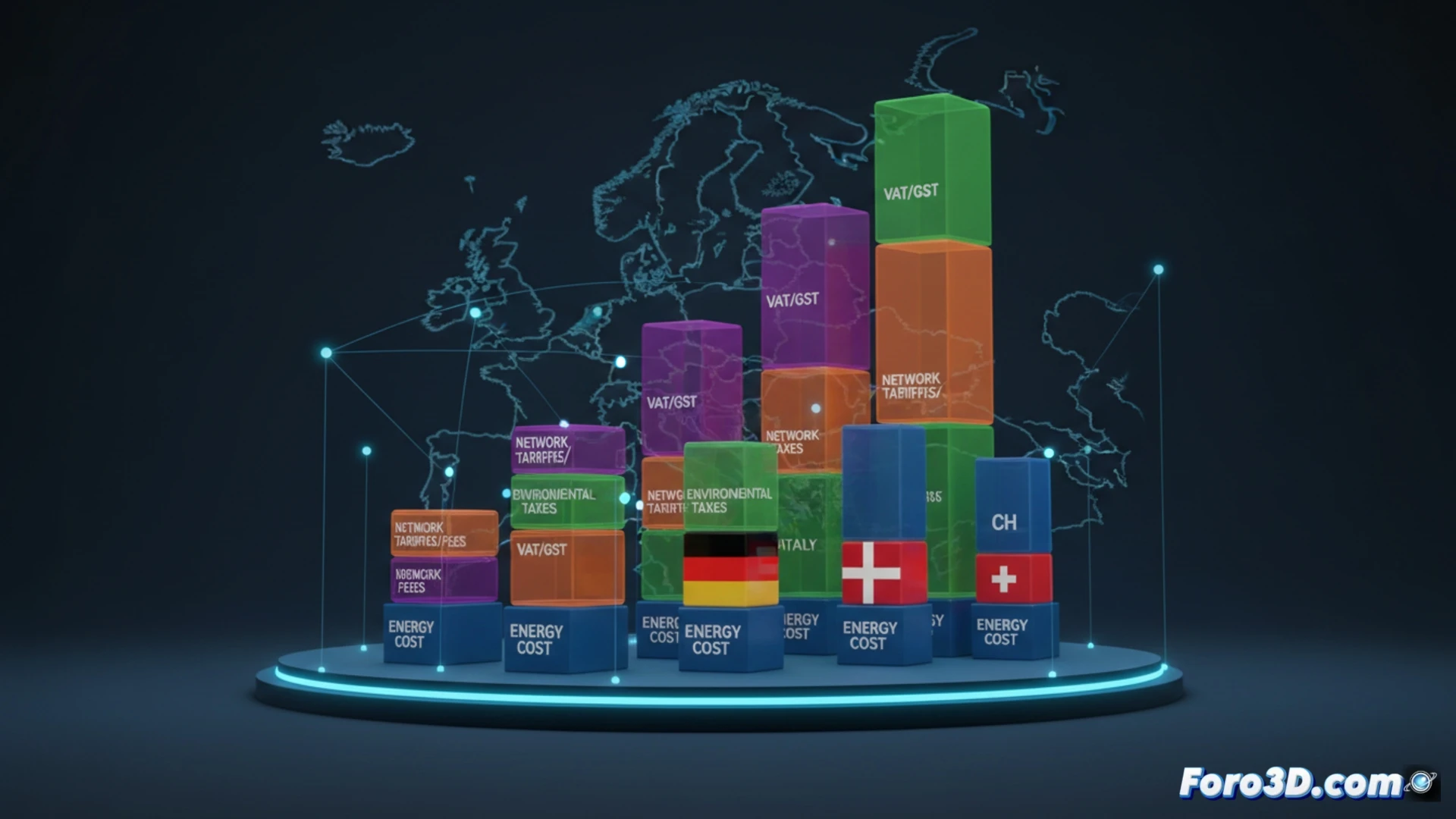
3D Modeling of the Cost Structure: Breakdown by Fiscal Layers 🧱
The proposal consists of creating a three-dimensional graphic model where each bill is represented as a prism. The total height equals the final price paid by the consumer. This prism is segmented into layers of distinct colors and volumes: a base for the wholesale energy cost, on top of which solid layers for state and regional taxes are stacked, and another for network tolls. For countries like those mentioned, negative or subsidy layers would be included, which reduce the total height. The simultaneous comparison of several prisms allows appreciating at a glance how, even with a similar base, the accumulation of fiscal layers in Spain results in a taller and more expensive structure.
Beyond the kWh Price: The Geopolitics of the Bill 🗺️
This visualization not only clarifies data but evidences a political decision. It shows how taxation can disincentivize or protect, and how the bill structure is a thermometer of national priorities. In a single energy market, these disparities raise questions about competitiveness and equity. The 3D infographic thus serves as a critical tool for an informed debate on energy transition and fiscal justice.
How does the heterogeneous fiscal structure of European countries affect the competitiveness of their 3D-intensive energy industries, such as large-scale additive manufacturing?
(PS: 3D financial dashboards are like sales: everything seems more attractive than it is)