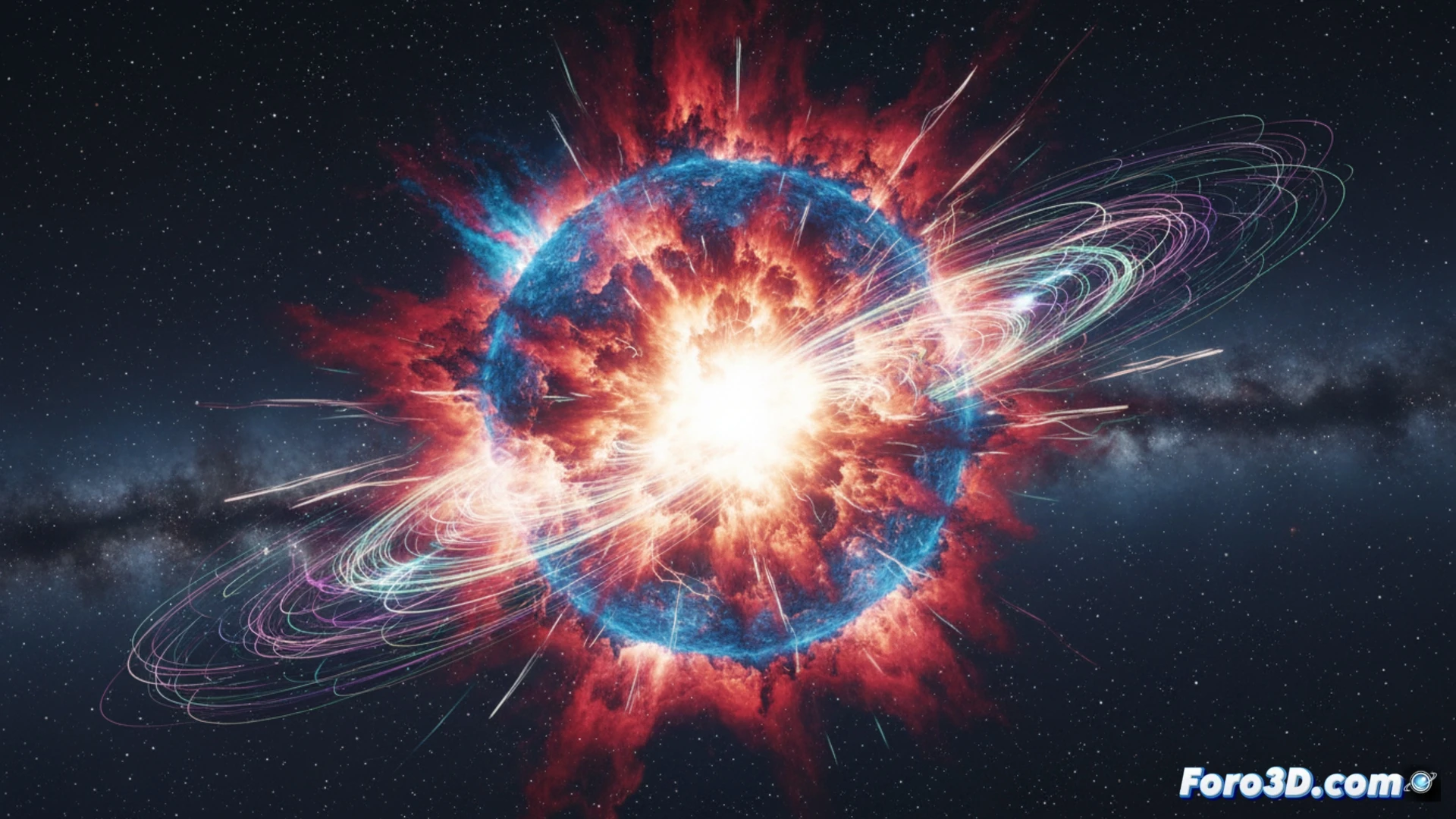
A historic astrophysical discovery, the observation of a magnetar's birth in the supernova SN 2024fav, poses a communication challenge. How to represent such an extreme and complex process? This is where 3D scientific visualization becomes crucial. It's not just about illustrating, but about creating a dynamic model that translates observational data into an intuitive physical narrative, allowing us to see and understand the violent formation of this object and the energy it releases.
From data to 3D model: recreating the relativistic screech 🔬
The key was detecting the signature of the relativistic screech, the deceleration of the newborn magnetar. A technical 3D visualization could model this process in several layers. First, the supernova explosion and the ejection of matter. Then, the collapsed core turned into a neutron star with intense magnetic fields, represented through field line geometry. The animation would show how this field acts as a brake, transferring rotational energy to the expelled envelope. The resulting superluminous light curve could be integrated as a graph that responds to the simulation, directly linking the internal physics with the external observation.
Beyond the image: simulation as a research tool 🧩
This case demonstrates that 3D visualization ceases to be a mere outreach tool to become an analysis environment. An interactive model would allow researchers to vary parameters such as the initial rotation speed or the magnetic field strength, and observe their immediate impact on the predicted light curve. Thus, it transforms into a bidirectional bridge between theory and observation, facilitating the exploration of hypotheses and a deep understanding of the universe's most exotic physical mechanisms.
How can we use 3D scientific visualization techniques to effectively represent and communicate the complex magnetic fields and collapse processes involved in the birth of a magnetar?
(P.S.: modeling manta rays is easy, the hard part is making them not look like floating plastic bags)