An official alliance between the UN and a team of six volunteer students has resulted in an innovative digital platform. This project, active since 2023, has developed a tool for the UN Digital Library that transforms decades of voting records into interactive visualizations. Through dynamic maps and charts, it allows dissecting political alignments between member states throughout history, offering a new layer of transparency and analysis for geopolitical scrutiny.
From historical data to interactive maps: overcoming technical challenges 🛠️
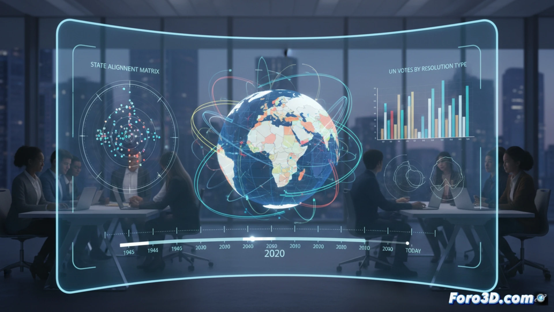
The technical core of the project lies in transforming a complex historical archive into an intuitive visual experience. The platform generates interactive maps that compare voting patterns between countries on specific resolutions, revealing coalitions and divergences immediately. One of the biggest obstacles was normalizing the data to reflect geopolitical evolution since 1945, managing changes in nations' names and borders. This process of data cleaning and structuring was fundamental to ensure historical accuracy. Development has been guided by constant feedback from UN experts, ensuring the tool meets real analytical needs of diplomats and researchers.
Civic technology for more transparent global governance 🌐
This case study exemplifies the power of civic technology applied to global governance. By making international diplomacy patterns accessible and understandable, the tool democratizes political analysis. It is not only a resource for specialists but also a bridge for citizens to understand UN dynamics. This project underscores how 3D and 2D data visualization can be a pillar for informed participation, turning raw data into visual narratives that foster accountability and evidence-based public debate.
How can 3D data visualization transform public understanding of global diplomacy and foster more informed citizen participation in international affairs?
(P.S.: visualizing a political debate in 3D is easy, the hard part is making it not look like a WWE match)