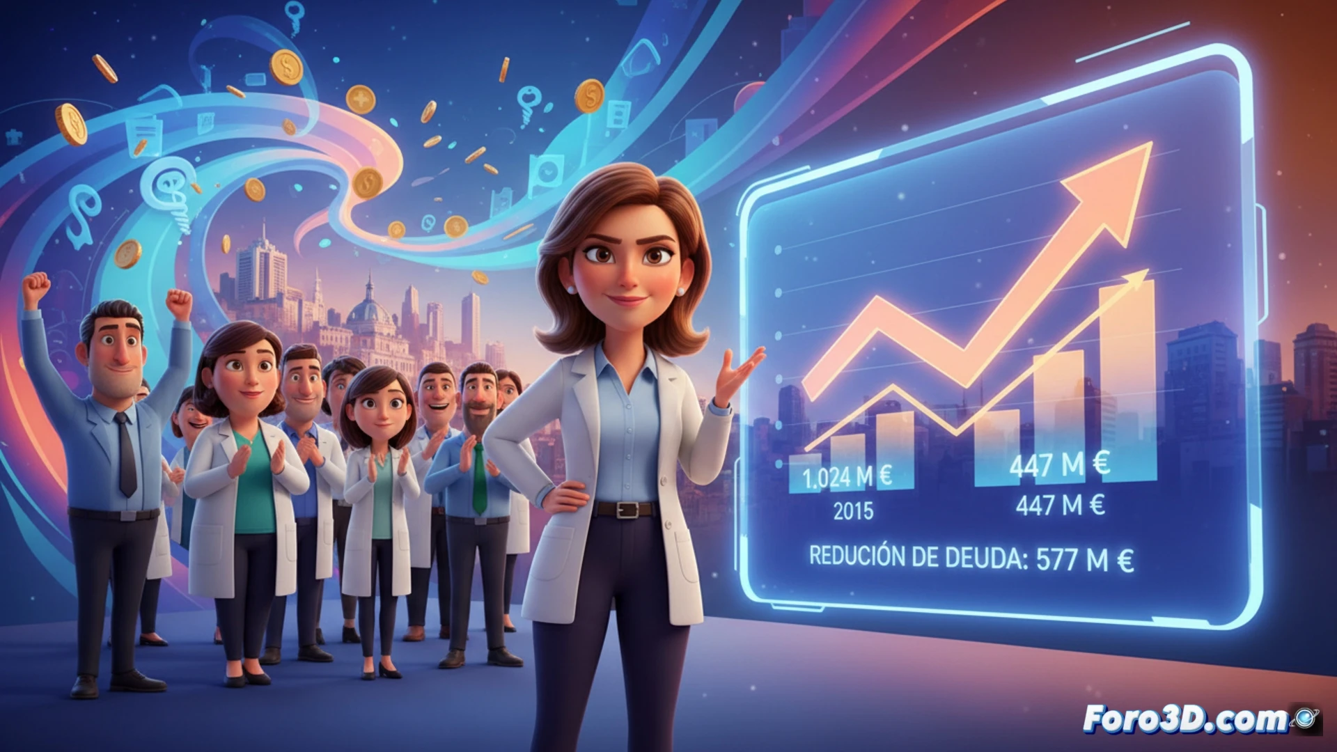
Public debt management is a complex process that, when explained with figures, can seem abstract. A clear case is the reduction of 577 million in the Community of Madrid's debt with Quirónsalud between 2015 and 2022. 3D financial visualization transforms these data into an intuitive spatial narrative. It allows representing the decline from 1,024 to 447 million euros not as numbers, but as a volume that contracts over time, offering an immediate understanding of the magnitude of the cleanup.
Building an interactive temporal model 📊
To represent this case, we propose a 3D model based on a linear temporal axis (2015-2022). Over each year, a column or volume proportional to the debt amount would rise. The height difference between 2015 and 2022 would be dramatic, visualizing the 577 million reduction. The model can be interactive: by selecting a year, a breakdown of the concepts that originated that debt would deploy, such as surgical agreements. Using a color gradient, from intense red to green, would reinforce the idea of correction. Tools like Blender or web libraries (Three.js) allow creating these animated visualizations, where the camera travels along the timeline, emphasizing the starting and ending points.
Beyond the graph: transparency and spatial analysis 🔍
This visualization goes beyond mere illustration. It turns budget stability policy into an object analyzable from multiple perspectives. A citizen can perceive the cleanup effort at a glance, while an analyst could cross these volumes with other data, such as annual health spending. 3D visualization thus serves as a tool for transparency and deep analysis, allowing exploration of a government's financial history in a space where the dimension of time and economic magnitude converge tangibly.
How can an interactive 3D model transform public understanding of debt reduction, using the evolution of Madrid and Quirónsalud as a case study? 💰
(P.S.: financial virtual reality: where you can see your money disappear in high definition)