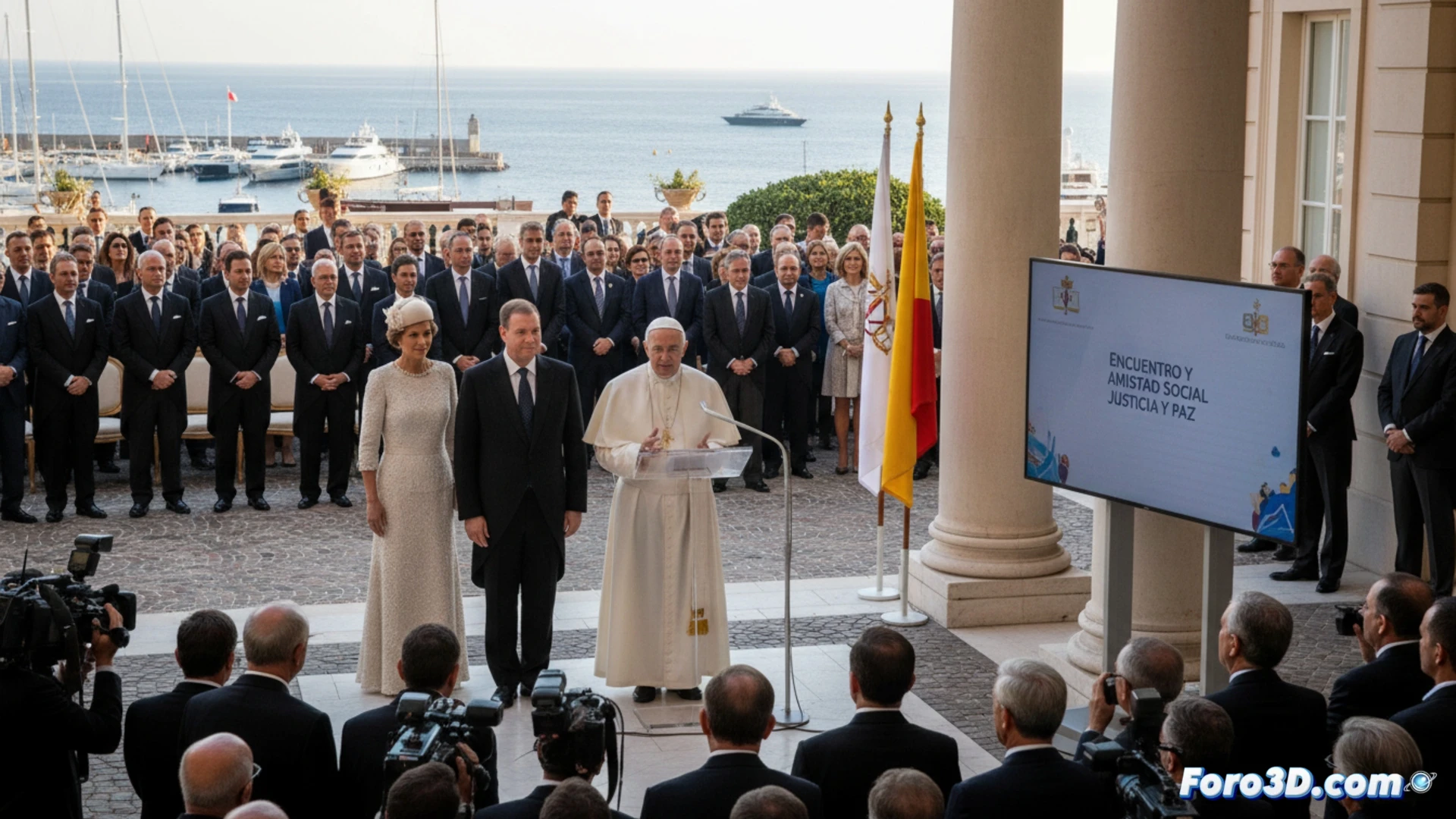
Pope Leo XIV's recent speech in Monaco transcends the religious to insert itself into the global political debate on inequality. His message, directed at one of the world's most concentrated elites, uses the parable of the talents to demand a redistribution of wealth in service of justice. This event is an ideal case study for applying visual and 3D analysis tools, breaking down the narrative and its geopolitical context to understand the layers of its strategic communication.
3D Deconstruction of the Narrative: Semantic and Geopolitical Layers 🗺️
Through an interactive 3D model, we can visualize the architecture of the speech. One axis would represent the temporal progression of the message, another the intensity of key concepts like justice, service, or unjust structures. A third axis would geographically contextualize the implicit references. The parable of the talents would act as the central node, connected to real-time global economic data, visually contrasting Monaco's wealth with worldwide inequality indicators. This visualization would reveal the rhetorical precision of choosing that symbol in that specific place.
Data Visualization as a Tool for Political Critique 📊
Technical analysis is not an end in itself, but a powerful lens for critique. By mapping the Pontiff's words against wealth and poverty databases, the visualization turns a speech into an interactive empirical argument. It allows simulating the impact of his proposals and evaluating the coherence between the message in an opulent enclave and global data. This methodology transforms political analysis, offering a tangible way to question narratives and measure the distance between rhetoric and structural reality.
How is moral authority built through visual staging in a political speech, and what elements of image analysis reveal the tension between the social justice message and the luxury environment in the papal speech in Monaco?
(P.S.: visualizing political lies in 3D is easy, the hard part is fitting so many simultaneously)