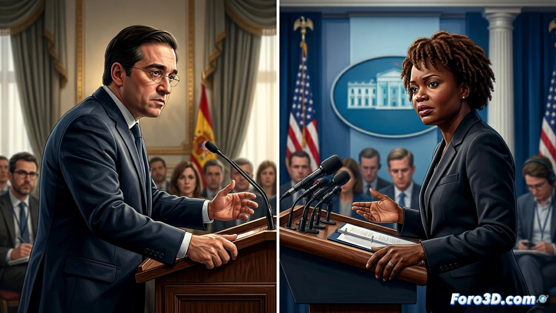
The recent exchange of statements between the Spanish minister Albares and the White House spokesperson, Leavitt, is a perfect case study for technology-assisted political communication analysis. Beyond the categorical denial, the event reveals a battle for control of the narrative. Here, 3D visualization and video analysis tools can transform the he said, she said into an objective map of gestures, contexts, and networks of influence, allowing for a deeper understanding of the diplomatic pulse.
From Words to 3D Model: Visualizing Conflicting Narratives 🗺️
Imagine an interactive 3D infographic. On a temporal axis, videos of Leavitt's and Albares' statements are synchronized. Through voice analysis, emphases and pauses are highlighted. With computer vision, key microexpressions on their faces are tracked, such as flashes of surprise or firmness. A 3D globe geolocalizes the conflict in the Middle East, the Spanish bases, and Washington. Finally, a nodal graph grows around Spain, visualizing in real time the international colleagues offering support, thus mapping the network of alliances that Albares claims is consolidating.
Technology as an Antidote to Strategic Disinformation 🔍
This approach is not just flashy graphics. It is a methodology for breaking down disinformation or biased narratives. By visually isolating and contrasting each statement in its space-time context and with its emotional charge, the public is provided with a more robust analytical framework. Technology, in this niche, becomes a critical magnifying glass that verifies coherence and exposes communication strategies, reaffirming that in politics, how something is said is as crucial as what is said.
Do you think it is possible to visualize in 3D the contradictions between two official statements?