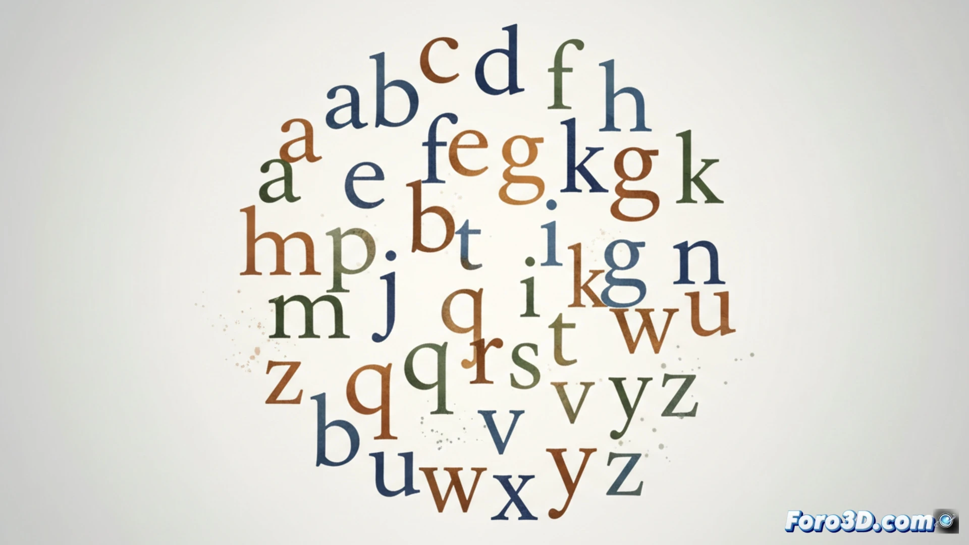
Fonts that imitate handwriting usually have an obvious problem: when writing, identical letters repeat consecutively, breaking the illusion of a natural stroke. Rando Sans, created by designer Beau Maher, addresses this issue. It is a dynamic typeface that uses random variations of each glyph as it is written, generating a more organic and believable visual result.
The mechanism of contextual alternates and pseudorandom code ✨
The technical solution of Rando Sans is based on the Contextual Alternates function of OpenType. This feature allows automatically substituting one glyph for another based on its context. Combined with specific code, the font activates multiple versions of the same letter in a non-deterministic order. The system prevents two identical characters from appearing together, applying a pseudorandom logic that distributes the available variants without a predictable pattern.
Goodbye to factory calligraphy, hello to controlled chaos 🎲
With this, we can finally say goodbye to those texts that seem written by a robot with only three letter molds in its memory. Rando Sans introduces the luck factor into typography: you never know which a you're going to get, but at least it won't be the same as the previous one. It's like having a calligraphic assistant with a slight obsessive disorder, but oriented towards variety. That said, randomness has rules, because even simulated authenticity needs its code of conduct.