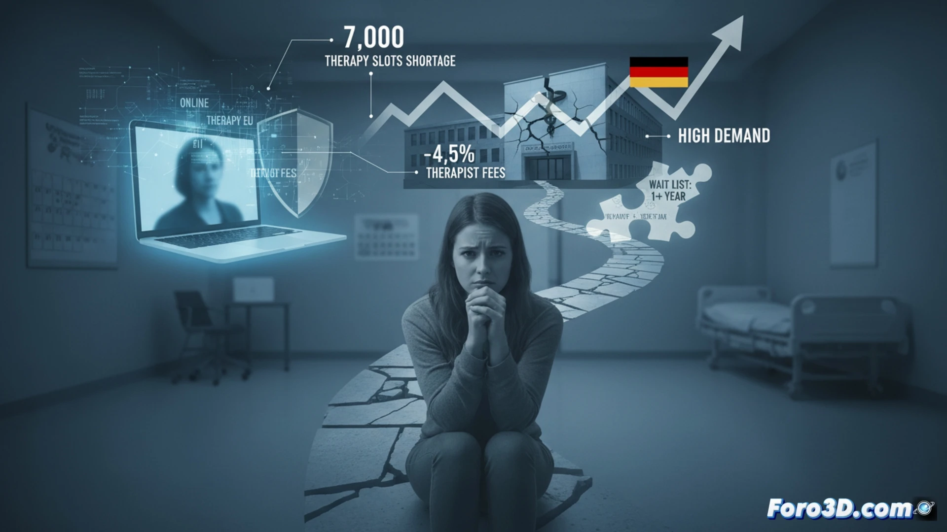
Germany faces a silent mental health emergency. With 18 million adults affected annually, the system is collapsing due to an estimated shortage of 7000 therapy slots. Waiting lists exceed a year, worsening individual crises, as shown by Nia's traumatic ordeal. In response, digital alternatives are emerging, while the system considers cutting psychotherapists' fees by 4.5%, a dangerous paradox in a context of critical demand.
3D Modeling of Unmet Demand and Patient Flows 🗺️
Visual epidemiology allows analyzing this crisis with interactive 3D infographics. A map of Germany could show the geographic density of the therapy slot shortage, encoded by color and height. A temporal flow diagram would illustrate the traumatic ordeal of patients like Nia: from the initial search to hospitalization, passing through failed calls and waiting lists. A comparative chart would model the volume of patients attempting to shift to intra-EU online therapy or AI tools, contrasting their immediate accessibility with uncertainty about their efficacy and regulation compared to traditional treatment.
The Visual Paradox: Cuts on a Map of Growing Need 📉
The possible 4.5% reduction in fees is a contradictory vector in this model. Visually, it translates into a chart where the demand curve follows an upward exponential, while the economic incentive for therapists curve inflects downward. This divergence threatens to widen the gaps in the 3D coverage map, pushing patients even more toward unsupervised digital solutions. The visualization not only describes the crisis but projects its worsening.
How would you create an interactive map showing data by age groups and sex?