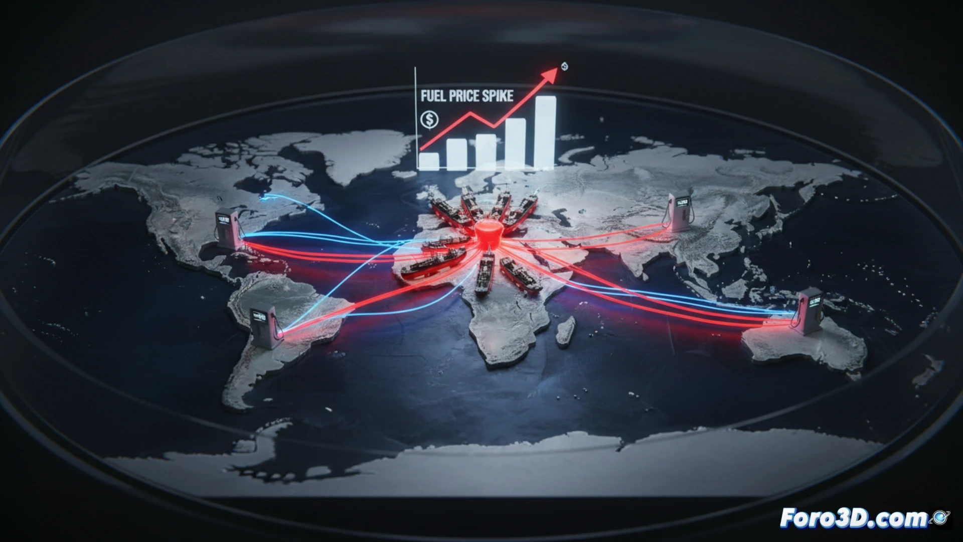
Tensions with Iran are already driving up gasoline prices in California, an immediate effect of geopolitics on the wallet. This event is a perfect case study to analyze the global supply chain. Instead of just citing figures, we can visualize the vulnerability. I propose creating an interactive 3D map that traces the route of crude oil from the Persian Gulf, through the critical Strait of Hormuz, to U.S. refineries and gas stations, illustrating the strategic bottleneck.
Flow Visualization: From Geopolitical Tension to Pump Price 🗺️
The analysis should go beyond the static map. A dynamic flow chart can connect event nodes: incident in the Middle East, perceived disruption in Hormuz, panic in futures markets, rise in Brent/WTI barrel price, and adjustment at fuel terminals. We can simulate two scenarios with sliders. Escalation scenario: if the barrel exceeds $100, the model projects prices of 5-6 dollars per gallon, coloring gas stations red on a U.S. map. Stable scenario: with containment and response from other producers, the price stays below 2022 records.
Strategic Dependence in Real Time ⚡
These visualizations expose the critical dependence on a single maritime route. A localized conflict has an almost instantaneous global domino effect, evidencing the fragility of linear supply chains. The simulation does not predict the future, but quantifies risks. As long as the tension persists, the upward pressure will be a constant, reminding us that geopolitics and logistics are the true determinants of energy costs in our daily lives.
How to model in 3D the vulnerability of oil maritime routes to predict the geopolitical impact on final fuel prices?
(PS: visualizing the global supply chain is like following a trail of breadcrumbs... in 3D)