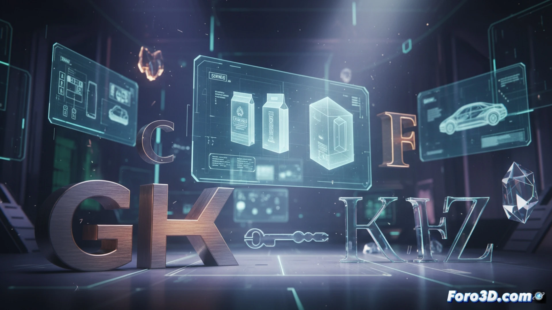
In 3D product design, typography is not an addition, but a key structural component. Whether to integrate a logo into a model, add information to a virtual package, or create signage in an architectural visualization, the chosen font defines the tone and credibility of the project. This guide explores fonts that combine technical legibility with personality, crucial for renders that communicate with impact.
Technical analysis: Montserrat and Nothing Pena applied to 3D 🎯
For 3D projects with a modern and urban style, Montserrat in its Bold variable is ideal. Its clear and robust geometry reads perfectly from any camera angle or render distance, making it excellent for headlines in product presentations. In contrast, Nothing Pena offers an organic solution. This hand-drawn font brings warmth and a human touch to renders of eco-friendly, artisanal products or those seeking to differentiate from digital coldness. Its controlled irregularity adds realism and texture to the scene.
The license as part of the professional workflow ⚖️
Including text in a 3D model for a client or portfolio implies commercial use. Always check the font's license terms. Using a typography without proper permissions can invalidate a professional project. Invest time in selecting fonts with clear licenses, preferably free for commercial use or legally acquired. This precaution is as critical as choosing the right material or lighting in your 3D scene.
How to select typographies that reinforce the credibility and message of a 3D product in professional renders and presentations? 🖋️
(PS: Designing a product in 3D is like being an architect, but without having to worry about the bricks.)