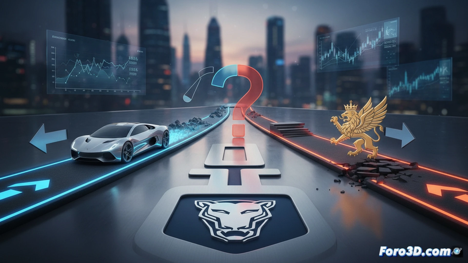
In the digital era, a makeover can turn into a battlefield in hours. Brands that redesign their identity face an immediate dilemma when the reaction is negative: stick with the new direction or revert to the familiar. Two recent cases, Jaguar and HBO Max, illustrate opposite paths and the strategic reasons behind each decision.
The backend of identity: when the brand code is irreversible 🔧
The technical decision behind a rebranding is similar to migrating a legacy system. Jaguar assessed that its old brand architecture was incompatible with its new electric engine. They accepted the cost of the migration (criticism) for a coherent future stack. HBO Max, on the other hand, detected a critical usability bug after merging with Discovery+; user confusion was a system error that prevented basic functionality. Its rollback was a necessary fix to maintain service operability.
The manual of the perfect 'brandicide' 💀
For those executives who crave their minute of fame in a Twitter thread full of memes, the recipe is simple: launch a logo that looks like it was made in Paint, defend it with a statement about the essence of modernity, and then blame users for not understanding your artistic vision. If social pressure intensifies, you can always make the epic bow: announce that you listened to your community and recover the old logo, going down in history as an example of what not to do. A complete lifecycle in just one week.