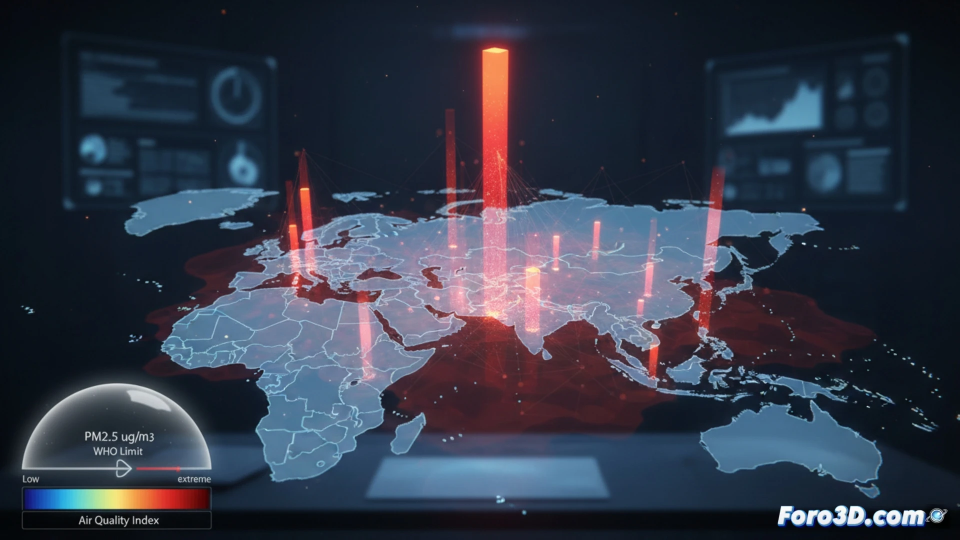
The latest IQAir report reveals a public health crisis in Asia. Three Indian cities lead the ranking of the most polluted, with Loni reaching 112.5 µg/m³ of PM2.5, a value 22 times higher than the WHO safe limit. Pakistan and India are the most affected countries. These data are not just numbers; they represent a massive epidemiological risk that requires advanced tools for its understanding and effective communication to society and policymakers.
Case study: Interactive 3D Maps for Environmental Epidemiology 🗺️
This report is the perfect case study for 3D visualization in public health. We propose developing an interactive geospatial model that topographically represents PM2.5 concentrations in India, Pakistan, and China. Cities would appear as columns or volumes whose height and color intensity reflect the measured micrograms, with a reference plane marking the WHO limit of 5 µg/m³. Overlaid data layers could be integrated, such as population density, asthma or COPD hospitalization rates, simulating pollution spread and its health impact with particle animations.
From Data to Action in Public Health 🚨
The power of this visualization lies in transforming complex data into an intuitive spatial narrative. A 3D map allows identifying geographic correlations, assessing the scope of the problem, and modeling intervention scenarios. By making the invisible threat of PM2.5 tangible, it strengthens the evidence to drive air quality policies. 3D technology thus becomes a critical bridge between epidemiology, citizen awareness, and government action.
How can 3D visualization of PM2.5 data transform public health understanding and response to the air pollution crisis in Asian cities?
(P.S.: At Foro3D, we know the only epidemic that affects us is the lack of polygons)