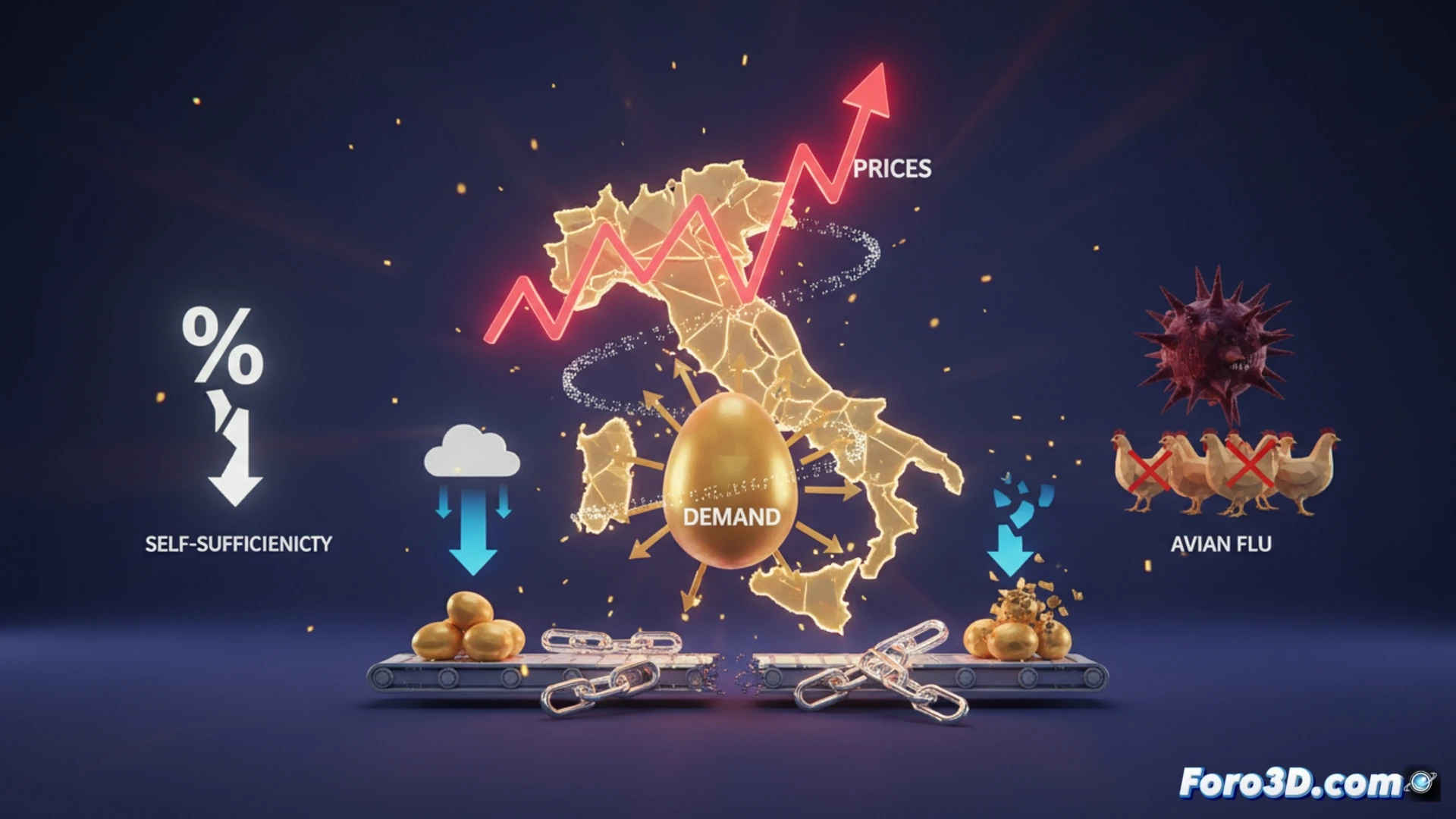
The egg market in Italy presents a complex economic dynamic and visually powerful for 3D analysis. Since January 2025, prices have skyrocketed by 27% for free-range eggs and 23% for caged eggs. This price shock, however, has not cooled demand, which grew by 7%. The key lies in supply: an avian flu outbreak in Europe reduced availability, forcing a 9% increase in Italian imports and reducing self-sufficiency from 97% to 94%.
3D Modeling of the Perfect Storm: Animated Graphs and Flow Maps 🎬
To understand this crisis, we propose three 3D visualizations. First, a temporal animated graph with two superimposed curves: the weekly evolution of prices for both types of eggs, showing the divergence and peak. Second, a supply-demand relationship graph: a 3D plane where a decline in European supply (Z-axis) pushes up the volume of Italian imports (Y-axis). Third, a geospatial 3D map of the supply chain. Europe would be modeled, highlighting in red the avian outbreak zones and the consequent closure of export flows to Italy. Animated arrows would show the increase in import flows from other origins, while a national indicator shows in real time the decline in self-sufficiency from 97% to 94%.
The Fragility of Systems in Three-Dimensional Data 🧩
This crisis is an ideal case study for 3D economics. A localized health event (avian flu) amplifies through an interconnected supply chain, generating visible effects on prices, trade, and food security. Visualizing this data in 3D not only clarifies the correlation but exposes the vulnerability of an apparently stable system. The spatial representation of the problem turns abstract data into a tangible narrative about interdependence and resilience.
How can 3D modeling of the supply chain and scenario simulation help predict and mitigate future price crises in the egg market?
(P.S.: At Foro3D we predict markets like we predict the weather: sometimes the TV news gets it right)