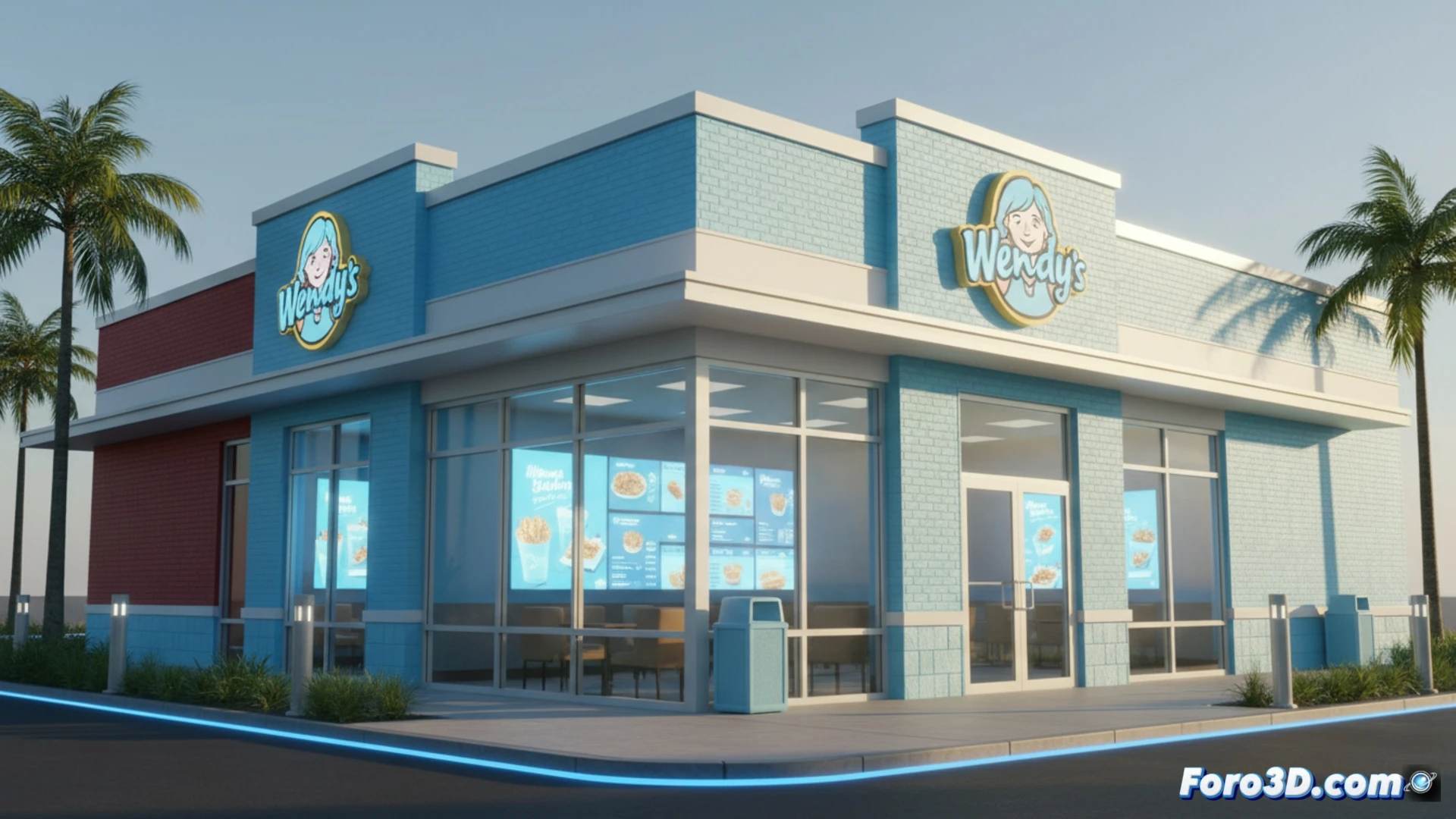
The fast-food chain Wendy's has left behind its iconic red color to paint its restaurants light blue, as part of its Future Fresh initiative. The change includes interactive digital screens and a new loyalty program. A curious decision, since red stimulates appetite, while blue has the opposite effect.
Digital Screens and Data: The Technical Strategy of the Change 📱
The visual renovation is accompanied by a technological layer. The new digital screens in the restaurants allow for real-time menu updates and promotion of offers based on the time of day. The loyalty program, integrated into the app, tracks orders to personalize discounts. All of this aims to optimize operations and reduce printing costs, although the main focus remains the customer experience at the counter.
Blue Against Hunger: Wendy's Masterstroke 🧠
Science says that blue reduces appetite, but Wendy's is betting that its customers won't read colorimetry studies. Perhaps the strategy is that you order less because of the color, but pay more for the technology. Or maybe they just want you to look at the screens and forget that your burger looks less appetizing. A visual trick that, ironically, could make you eat faster so you don't have to look at the walls.