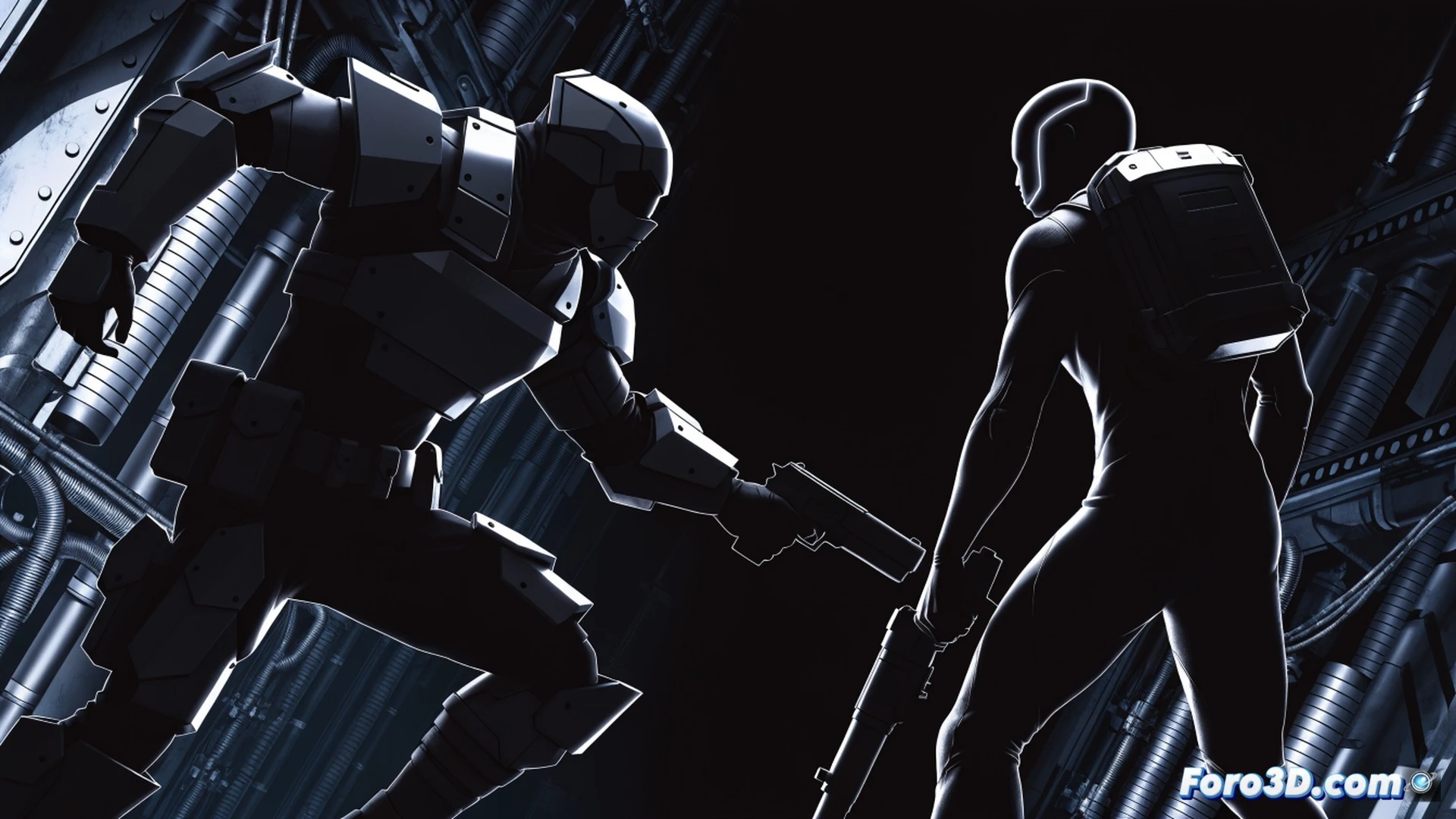
Photorealism was for years the visual goal of the genre, but a new trend prioritizes competitive clarity over detail. Designers of titles like Valorant or Overwatch 2 bet on sharp silhouettes and high-contrast palettes. It's not a step backward, but a functional decision: in a firefight, identifying the enemy amidst the chaos is worth more than counting the pores on their skin.
Perception Optimization: The Engine Behind Readability 🎯
Technically, this approach reduces the player's cognitive load. By limiting the color palette and simplifying shapes, the graphics engine can allocate resources to frame smoothness and input response. Models with defined edges and flat colors eliminate the visual noise generated by complex textures or specular reflections. In competitive matches, this allows the human eye to process threats in milliseconds, without relying on a global illumination system that often hides characters in shadows.
Goodbye Roughness Maps: Hello, Visible Head 👁️
Sometimes you wonder if old-school developers hated their players. Maps with hyperrealistic textures where enemies camouflaged against a brick wall or blended into a puddle's reflection. Now, finally, someone said: hey, what if we paint the bad guy neon red against a gray background. Turns out it works. The next generation of shooters might have characters with glowing arrows above their heads. And honestly, it would be an improvement.