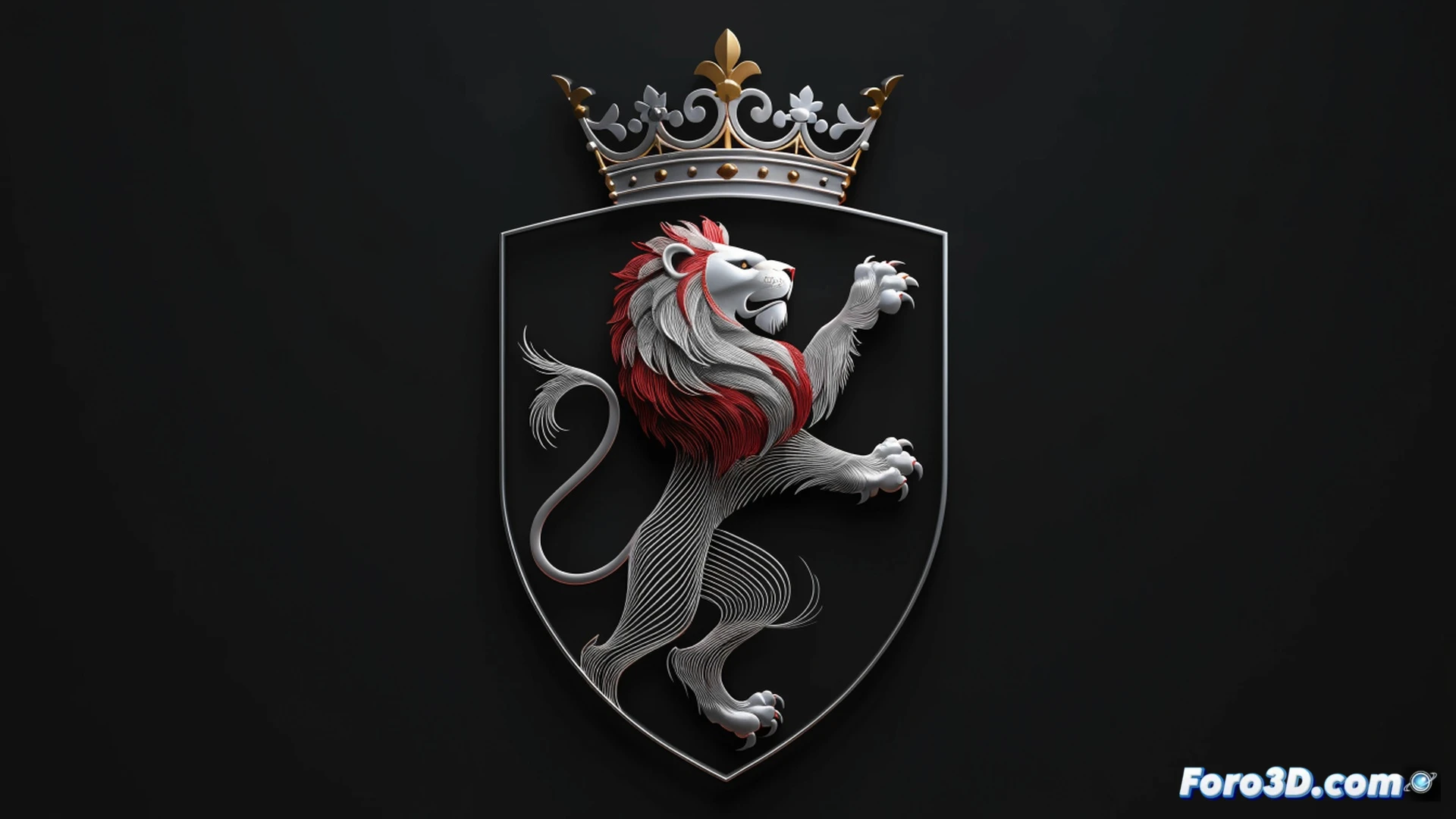
Sporting Portugal, the cradle of Cristiano Ronaldo, has unveiled its new crest on the occasion of its 120th anniversary. The update combines classic elements such as the rampant lion and the crown with a cleaner, more modern design. The board assures that the historical essence is maintained, but with sharper lines to connect with younger fans. The change is not radical, but a calculated evolution.
The technology behind a crest that respects the club's DNA 🛡️
From a graphic design perspective, the process involved vectorizing the strokes of the lion and the crown to achieve greater sharpness on digital platforms and social media. Superfluous details were reduced without losing the symbol's identity. Sports branding experts point out that this type of update aims to improve legibility on small screens, such as those of a mobile phone, and to unify the image on shirts, merchandise, and applications. There is no revolution, only technical optimization.
Purists are already sharpening their claws in the comments 🐾
As expected, divided opinions are already pouring in on social media. Some say the new lion looks like a house cat, and others claim the crown looks like it's from a cheap mobile game. The truth is, if the previous crest had been left untouched, the same critics would be calling for a change. In the end, Sporting has achieved the impossible: making no one talk about the team's results this weekend.