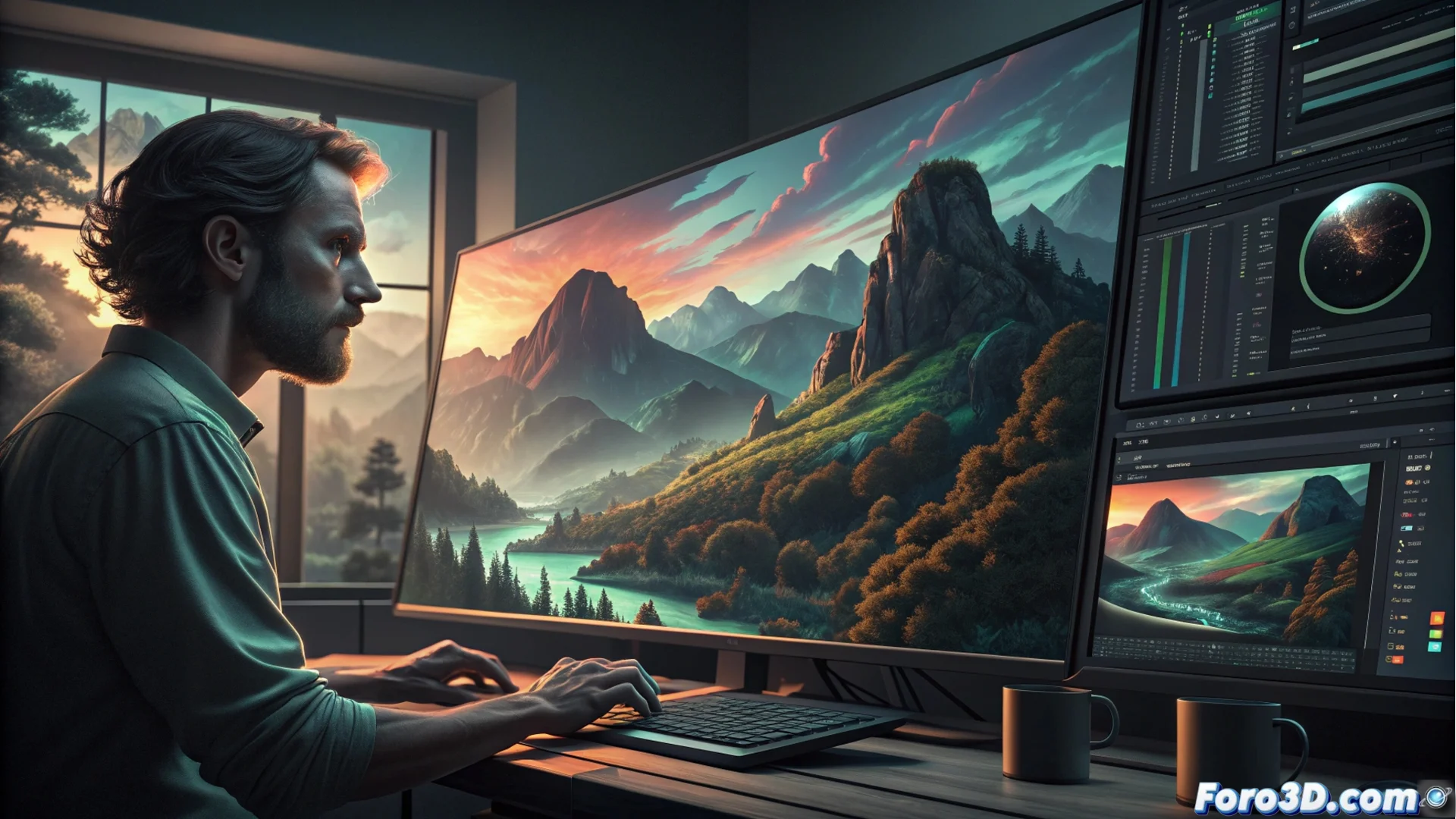
What is color grading and how it manipulates the image
Color grading is an essential stage in post-production where the color, contrast, and luminance of a digital image are altered. It is applied to finished photographs or illustrations to define an emotional tone, create a unified visual style, or resolve color issues. This step is key to achieving a professional result, as it harmonizes the color palette and directs how the viewer perceives it. Artists modify curves, balances, and saturation so that the image conveys the precise intention. 🎨
Key tools and methods for manipulating color
To alter the color, several tools are used. Tone curves allow precise adjustment of highlights, shadows, and midtones. Color wheels divide adjustments by luminance ranges, providing more intuitive control. Lookup tables (LUTs) apply predefined color transformations quickly, functioning as a base or final look. This workflow is usually divided into two phases: first color correction, which solves technical problems, and then color grading itself, which applies the artistic style.
Fundamental tools:- Tone curves: Precisely adjust luminosity values in the image.
- Color wheels: Control hues separately in highlights, shadows, and midtones.
- LUTs (Lookup Tables): Apply complex color profiles instantly for stylization.
Color grading is not just about making it look pretty; it is a visual language that speaks directly to the audience's emotions.
How it influences visual narrative
Color grading directly affects how a scene is interpreted. A cool palette with muted blues and greens can evoke melancholy or suspense, while a warm palette with oranges and yellows suggests warmth or nostalgia. By manipulating these elements, the story's atmosphere is enhanced and the viewer's gaze is directed toward specific focal points. Maintaining consistency in a complete project, such as a short film or a series of images, is vital to sustain immersion and visual identity.
Common narrative effects:- Cool palettes: Create atmospheres of tension, sadness, or futurism.
- Warm palettes: Convey emotions like nostalgia, joy, or intimacy.
- High contrast: Directs attention and adds drama to the composition.
Common mistakes to avoid
A common mistake is using LUTs indiscriminately without customizing them. This can make all images acquire a generic look, like the typical orange and teal look of many action movie posters, losing uniqueness and meaning. The true art of color grading lies in adjusting the tools to serve the specific narrative, not in applying preset filters. The key is to test and refine until the color communicates exactly what you need. ✨