When Visualization Challenges Health Standards
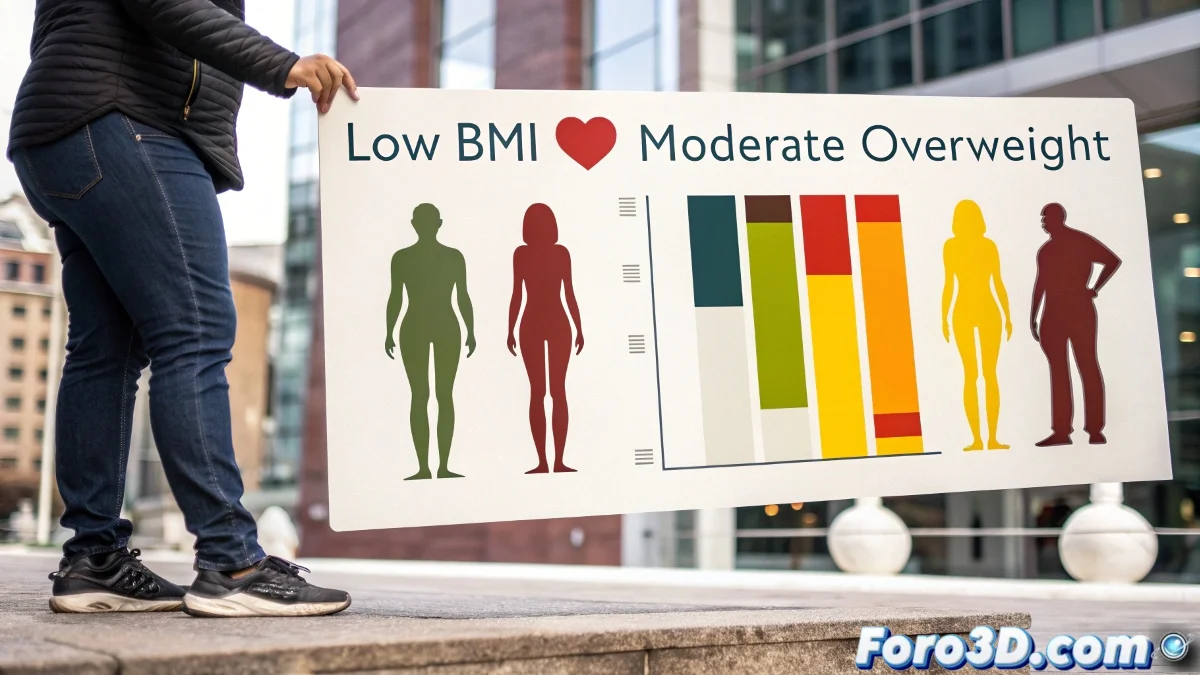
A recent study has revealed that low body mass index (BMI) could pose a greater mortality risk than moderate overweight, challenging established beliefs about weight and health. 📊⚕️ In Photoshop, we can create impactful visualizations that communicate these counterintuitive findings, using infographics, comparative charts, and symbolic representations of how underweight affects vital organs. These compositions help educate the public about lesser-known risks of extreme thinness.
Setup of the Medical-Visual Project
When starting Photoshop, a new document is created with appropriate resolution for the target medium—1920x1080 pixels for digital or higher resolution for print. 🎨 Layer organization is fundamental: Background, BMI_Graphics, Organ_Icons, and Risk_Indicators keep the workflow orderly and editable. Enabling guides and rulers ensures precise alignment of critical visual elements.
Health data visualization in Photoshop transforms abstract statistics into comprehensible visual narratives, helping to overcome cognitive biases and established beliefs about weight and well-being.
Design of Comparative BMI Charts
A visual BMI scale is created using vector shapes representing the different ranges: underweight, normal, overweight, and obesity. 📏 Each range is colored with an intuitive scheme—red for high risk, yellow for moderate, green for optimal—allowing immediate identification of danger zones. Bars or arcs proportionally show the increase in mortality risk, especially highlighting the paradox that underweight can be riskier than moderate overweight.
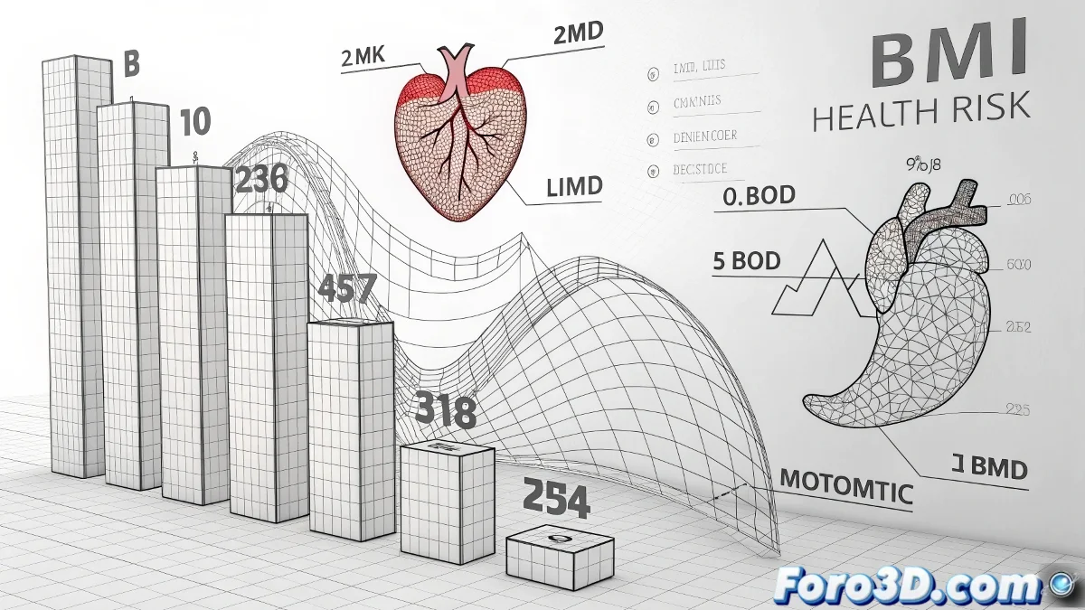
Representation of Organ Impacts
- Organ icons: Stylized representations of heart, lungs, liver, and brain are designed using shape tools.
- Affectation indicators: Opacity masks and gradients are used to show how underweight compromises organ function.
- Visual connections: Lines and arrows link specific BMI ranges with particularly affected organs.
Composition and Emphasis Techniques
Adjustment layers are employed for precise control of color and contrast, ensuring that risk elements stand out without visually saturating. 🖌️ Subtle glow effects on high-risk areas attract attention, while parallel shadows give depth and professionalism to the design. Typography (if included in editorial versions) is chosen for clarity and legibility, with variable weights to hierarchize information.
Applications and Ethical Considerations
These visualizations serve as educational materials for healthcare professionals, public awareness campaigns, and resources for media outlets. 🏥 It is crucial to maintain scientific accuracy—collaborating with medical professionals—and avoid stigmatizing any body type while educating about real risks. Visual metaphors are chosen to inform without unjustifiably alarming.
Export and Multi-Platform Use
The final design is exported in appropriate formats for different uses: PNG for web, PDF for print, and PSD preserved with layers for future modifications. 📱 Textless versions allow use in multilingual contexts or as a base for additional content generation.
Thus, while cultural standards often glorify extreme thinness, medical visualization reminds us that health exists in balance… and that sometimes, what seems visually ideal can be physiologically risky. Because in health information design, the only thing that should be light is the clarity of the message, not the body mass. 😉