Visual Tangents in 2D Illustration
Imagine you're creating a vibrant 2D illustration where every stroke tells a story, but suddenly, an accidental alignment between elements like shapes or lines ruins the charm, generating an interruption that flattens the scene and confuses the audience. This is what happens with visual tangents, a common stumble that can turn your work into a visual enigma. In my experience as an illustrator, I've seen how these errors undermine the narrative flow, so it's always vital to detect them to preserve the dynamic essence of your art. 😮
Common Examples in Everyday Scenarios
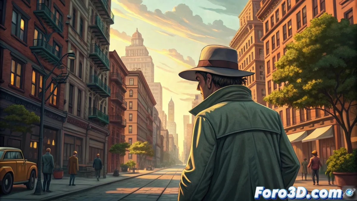
In the daily practice of illustration, visual tangents manifest in subtle but impactful ways, altering how the viewer interprets the scene. For instance, in an urban landscape, you might find that the edge of a building merges with a character's outline, joining unrelated elements and diverting attention from the main focus, which reduces visual depth and makes the composition seem forced rather than natural. This type of slip not only distracts but also weakens the overall narration of your illustration.
Common Examples:- In a character portrait, if the head touches the horizon line exactly, it generates tension that makes the subject appear to float or merge with the background, confusing the perception of space and subtracting dynamism from the image.
- In landscape compositions, like an urban setting, the alignment between a static object like a pole and the curve of a human figure creates an unwanted visual union that distracts from the central message and alters the illusion of depth.
- Another frequent case is when background lines cross with the edges of main elements, visually joining parts that should be separate, turning a vibrant scene into something flat and unconvincing. 😕
Almost as if you'd invented a new type of involuntary illusion, where your masterpiece turns into an optical puzzle that leaves the viewer wondering if the character is floating or fused with the environment!
Effective Strategies to Avoid Them
To combat these interruptions, the trick is to make meticulous adjustments in the arrangement of elements, such as slightly shifting an object to break that perfect alignment and restore visual depth. In my projects, I've discovered that this approach doesn't complicate the creative flow; on the contrary, it enriches the narration and makes the illustration flow more naturally, preventing the audience from stopping at unnecessary errors. Remember, a small change can make the difference between a flat piece and a captivating work. ⚙️
Practical Techniques for Correction:- Adjust the position of key elements in your scene, for example, moving a character a few millimeters to avoid its outline aligning with static backgrounds, which preserves the illusion of space and improves the overall composition.
- Evaluate alignment during the initial sketching stages, identifying potential tangents and correcting with subtle variations, like altering angles or scales, to maintain fluidity without sacrificing the visual message.
- Incorporate final reviews where you examine every interaction between elements, ensuring nothing merges accidentally, which strengthens the narration and avoids distractions in the viewer's perception. 🔍
Final Reflection on Their Impact
At the end of the day, although visual tangents may seem like a minor detail, their influence on the quality of your 2D illustration is profound, as they can turn a dynamic creation into a confusing illusion that frustrates the audience. In my opinion, by recognizing and correcting these issues, you not only elevate the visual depth of your works but also enrich the overall experience, ensuring that every element contributes to a fluid and engaging narration. Remember, the key is in balance: a well-polished illustration is like a living canvas, free from optical traps that steal its magic. 🌟