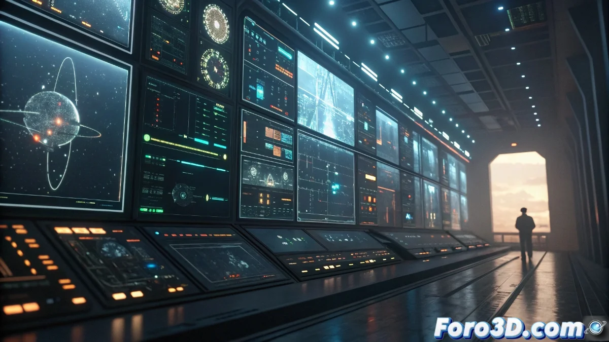
Visual Saturation in Interfaces: Causes and Practical Solutions
Uncontrolled accumulation of components in digital designs produces a saturation effect that seriously compromises the legibility and understanding of the main message. When multiple layers, complex textures, and overloaded color palettes compete simultaneously for attention, the result is perceptual chaos that frustrates communication objectives. 🎨
Origins of the Visual Saturation Problem
This phenomenon usually manifests when designers prioritize decorative aesthetic aspects over essential functionality, underestimating the cognitive impact it generates on users. The lack of simplification criteria leads to interfaces where every element struggles to stand out, creating a confusing and exhausting experience for human perception.
Factors that intensify saturation:- Excessive overlapping of layers without a defined purpose
- Indiscriminate use of textures and complex gradients
- Color palettes with too many contrasting tones
Elegance lies not in the abundance of elements, but in the precision of their arrangement - fewer well-organized components communicate more effectively than many disordered elements.
Effective Visual Desaturation Strategies
The implementation of clearly defined hierarchies through controlled variations in size, color contrast, and conscious spacing allows directing attention to truly important components. Deliberate simplification of color palettes and systematic elimination of superfluous ornaments create visual breathing spaces that significantly improve legibility and navigation.
Proven Techniques for Organizing Visual Space:- Application of Gestalt principles to group related elements
- Conducting usability tests to identify critical points
- Establishment of modular design systems with reusable components
Advanced Composition Tactics
The strategic use of blur effects on secondary planes adds dimensional depth without sacrificing informational clarity. Blending modes such as Multiply and Screen allow integrating elements while maintaining their independent visual identity. Subtle animations can naturally guide the flow of attention, although their excessive application contributes to the initial saturation problem. ⚖️
Technical Resources for Balanced Compositions:- Intelligent selection of blending modes between layers
- Implementation of grid systems for precise alignment
- Measured use of transitions and microinteractions
Balance Between Aesthetics and Functionality
The fundamental dilemma lies in reconciling aesthetic demands with practical usability requirements. While the "less is more" principle remains valid, real situations often present challenges where external considerations (such as client preferences) strain this ideal. The key is to develop creative solutions that respect both communicative clarity and project objectives, always avoiding compromising the legibility of central content. 🎯