When a 7-minute short teaches more than a thousand tutorials 🎨🏔️
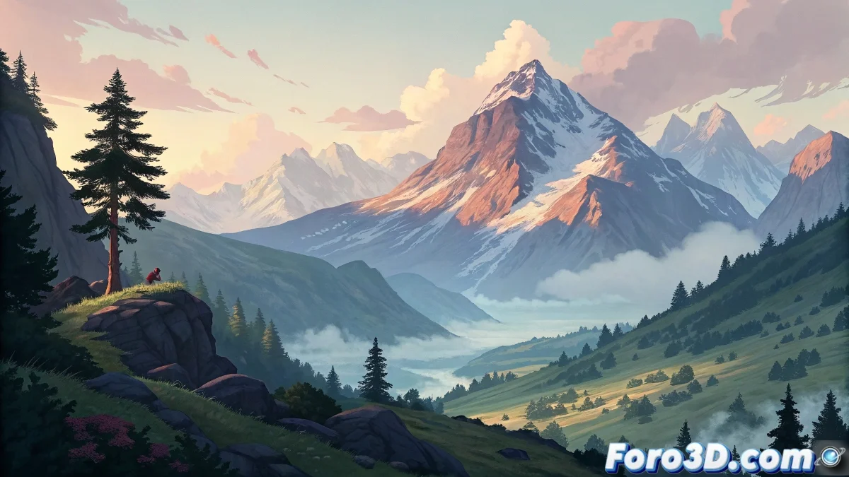
Il descend de la montagne proves that in animation, size doesn't matter (speaking of duration, of course). At just 7 minutes and 75MB, this short film offers a masterclass in set design that would bring any environment artist to tears of emotion.
"Good sets are like good waiters: they go unnoticed but make everything work" — Anonymous art director.
Visual lessons you can steal... I mean, draw inspiration from
- Detailed backgrounds that tell stories by themselves
- Stylized characters that contrast perfectly with the settings
- Atmospheres that convey emotions without dialogue
- Composition that guides the viewer's gaze
Why you should watch it (even in low quality)
This short is the perfect example of how:
- Good set design can compensate for technical limitations
- Well-applied stylization surpasses forced realism
- Visual coherence is more important than spectacular effects
Warning for explorers
If you decide to analyze it frame by frame (as any self-respecting obsessive artist would do):
- Prepare screenshots (Ctrl+C doesn't work in VLC, we know)
- Have a notebook handy for notes (or 50 open browser tabs)
- Don't get frustrated if your designs don't look the same on the first try
As a final piece of advice: if your hard drive is as full as ours, maybe you should stream it. Because when it literally decides to "descend the mountain", you won't be able to save your own projects. 💾⛷️
PS: If after watching it you don't feel like redesigning all your sets, you watched it with the monitor off.