Versatile Logos: The Era of Heavy-Weight Typography and Extreme Simplification
In today's multimedia ecosystem, a logo no longer lives only on letterhead or a storefront facade. It must exist with the same strength and identity on a 20-meter billboard as on a 20-pixel app icon. This multi-format demand has given rise to an unstoppable trend: the design of inherently versatile and scalable logos. To achieve this, brands are shifting toward a radical approach of structural simplification, adopting bold and heavy-weight typographies that guarantee instant readability and immediate visual impact, regardless of context or scale. It is the pursuit of pure design, where less is truly more. ⚖️
The Engineering of Perfect Scalability
Designing for scalability is no longer an advantage; it is a fundamental technical requirement. A modern logo must be like a vector: infinitely scalable without loss of quality or meaning. Heavy-weight typographies, with their thick strokes and solid outlines, are the perfect engineering solution for this challenge. Unlike thin fonts or delicate serifs that can disappear or "get dirty" when scaled down, a heavy typography maintains its visual integrity at any size. Its solid mass of ink translates into immediate recognition, whether you're seeing it from across the street or in your smartphone's status bar.
Why heavy-weight typographies excel in scalability:- Maintain readability in tiny sizes (favicons, app icons)
- Reduce visual complexity, eliminating noise at small scales
- Create strong and memorable visual impact at large scales
- Perform better in suboptimal viewing conditions (low resolution, glare)
- Allow more reliable reproduction across different printing methods and materials
Simplification as a Communication Strategy
This trend goes beyond the purely technical; it is a conscious communication strategy. In a world oversaturated with visual stimuli, a complex logo takes longer to process by the brain. A simplified and high-contrast design is processed almost instantly. The adoption of clean typographic structures, with generous kerning and clear geometric shapes, is not an empty aesthetic choice. It is a calculated decision to minimize brand recognition time to the absolute minimum. Every superfluous element removed is one less barrier between the brand and its audience.
The perfect 2025 logo is not the prettiest, but the one that reads fastest and is remembered most easily.
From Paper to Pixel: Coherence Across All Media
The true test of a versatile logo is its ability to maintain coherence in the transition between the physical and digital worlds. A heavy-weight and simplified typography makes this transition flawlessly. It reproduces with the same clarity in screen-printing ink as in OLED screen pixels. This coherence is fundamental to building a solid and reliable brand identity. Consumers subconsciously associate this visual consistency with the brand's values: solidity, reliability, and modernity. A logo that looks "broken" or illegible in certain contexts conveys exactly the opposite.
Stress tests for a versatile logo:- Readability in a 16x16 pixel favicon
- Recognition in a 32x32 pixel social media profile
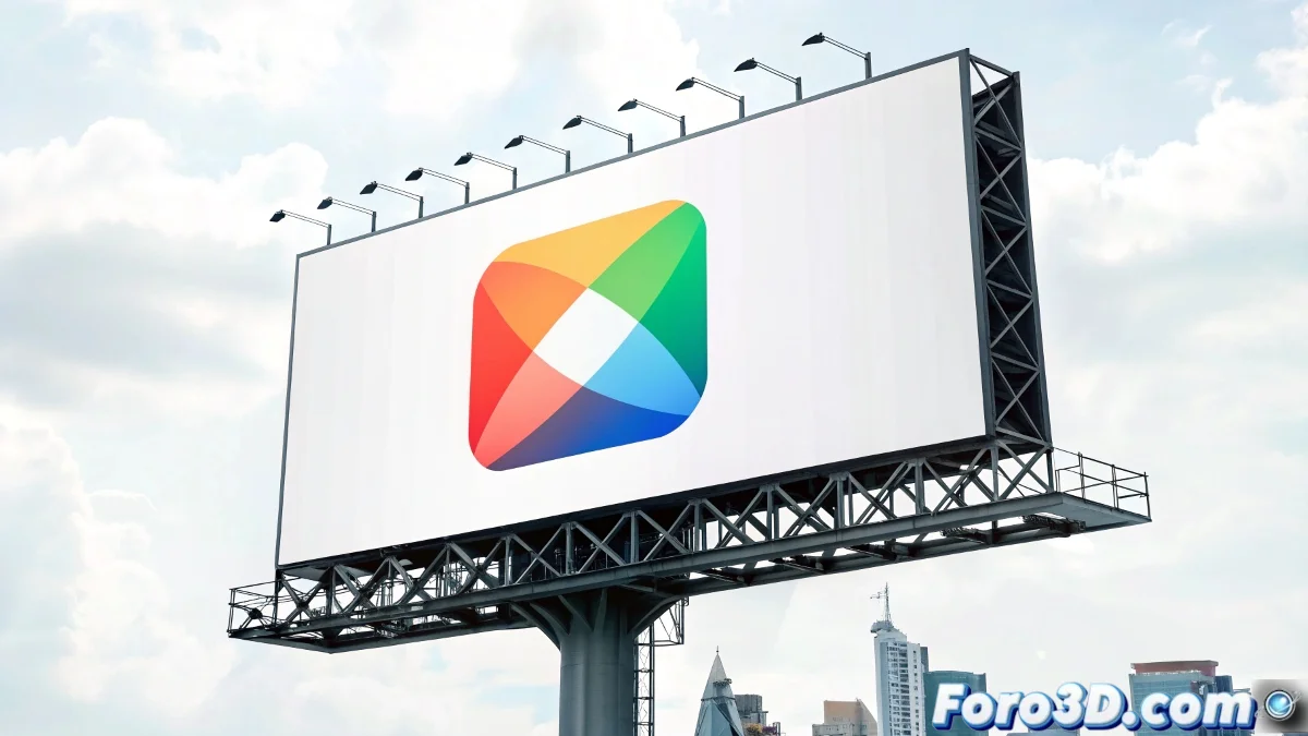
- Visual impact on a billboard viewed from 50 meters
- Reproducibility on a promotional pen or USB drive
- Functionality in monochrome mode (black and white printing or engraving)
The Balance Between Personality and Functionality
The risk of this trend toward simplification is homogenization. How to maintain personality when details are eliminated? The answer lies in the subtle balance between form and function. Designers are injecting personality not through ornaments, but through unique proportions, strategic cuts, or minimal but significant modifications in key characters. A custom ligature, a slightly angled terminal, or a specific stroke contrast can be enough to give a heavy and simple typography a distinctive and memorable character, without compromising its fundamental scalability.
The evolution toward versatile logos, built on heavy-weight typographies and extreme simplification, is a direct and pragmatic response to the demands of the contemporary media environment. It is not a fleeting fad, but a paradigm shift in identity design principles. Brands that adopt this approach will not only guarantee their technical legibility across all formats, but will be investing in a visual asset that can navigate with agility and consistency through the unpredictable future of media and platforms. In the era of divided attention, being clear and fast is not an option; it is the only strategy. 🎯