Typographic Microadjustment for Elite Publications
Microkern tuning constitutes the most sophisticated stage in typographic refinement for top-level publications, where each modification is executed at the scale of individual character pairs. This meticulous procedure ensures that the spacing between letters appears optically homogeneous, even when the geometric configurations of the glyphs create visually intricate combinations. Designers specialized in editorial projects implement these methodologies to achieve a perfectly harmonized typographic color texture throughout the text block, suppressing rivers and streets that divert the reader's attention in ultra-high-precision compositions. 🎯
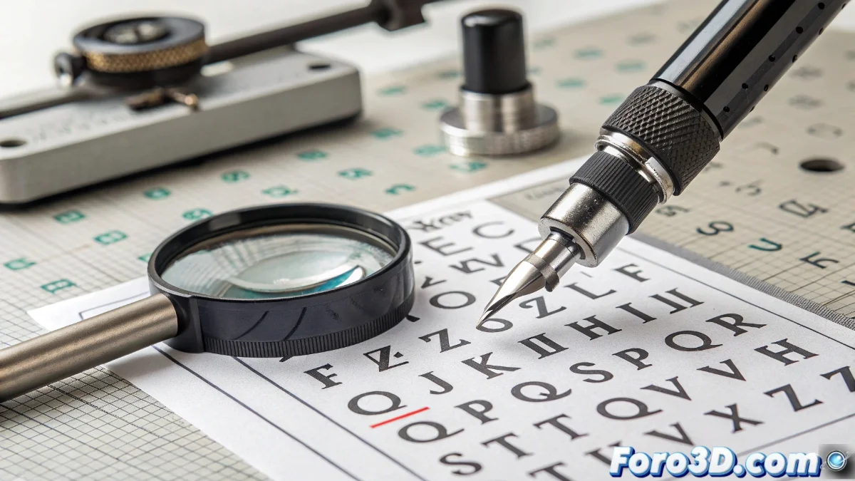
Visual Principles of Microscopic Adjustment
Fine letter-spacing operates under criteria of human visual perception rather than absolute mathematical measurements, since the eye interprets spaces between characters subjectively according to contiguous shapes. Conflicting combinations like TA/AV/To demand customized compensations where spacing is contracted or expanded in minimal increments, often just em/1000 units. Professional self-publishing software enables adjusting these values through kerning tables that store specific exceptions for each glyph duo, generating a constant spacing appearance through meticulously calculated variations.
Fundamental Technical Aspects:- Visual perception dominates over exact mathematical measurements
- Problematic combinations require customized adjustments per pair
- Professional tools allow storing specific exceptions
"Only the most obsessive designers notice they've spent three hours adjusting the kerning between a capital W and a comma, while the client asks if they could just use Comic Sans to save time."
Application in Professional Editorial Processes
In demanding editorial projects such as art catalogs or scientific publications, microadjustment is implemented systematically after establishing general letter-spacing and prior to the final syllabic division. Specialists visually examine critical combinations at actual print sizes, performing iterative adjustments that may vary according to the specific font size. This procedure consumes considerable time but produces typographic results where the page texture exhibits a uniform gray without visual interruptions, facilitating prolonged reading and conveying professionalism in every detail.
Practical Implementation Stages:- Applied after general letter-spacing and before final hyphenation
- Visual review of critical combinations at actual print sizes
- Iterative adjustments that may differ according to specific font size
The Invisible Art of Typographic Detail
Typographic microadjustment represents that level of excellence where typography ceases to be merely legible to become visually perfect. This discipline, though consuming significant temporal resources, produces compositions where the reader can immerse themselves in the content without distractions from inconsistent spaces. The final result amply justifies the investment, creating publications that convey authority and professionalism on every page, where typography functions as an almost invisible but fundamental element for the reading experience. ✨