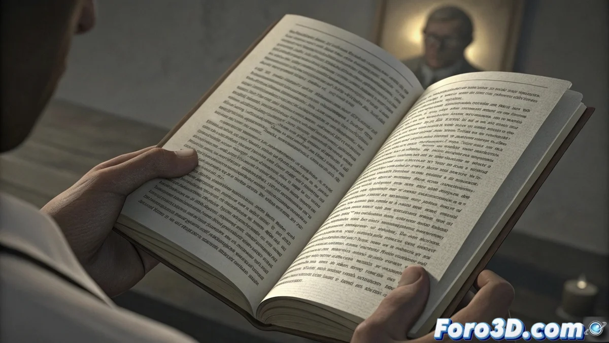
Typographic color defines the visual density of a text
In typography, the term color does not refer to the chromatic spectrum, but to the visual density or gray tone we perceive when observing a block of text on a page. This visual effect, sometimes subtle, results from combining multiple variables and directly affects how we read and how we feel a design. Mastering this concept is fundamental for any graphic project. 🎨
Elements that configure the visual color
Several typographic factors interact to create this color. It is not an isolated property of the font, but a dynamic relationship. Letterspacing, which includes adjustments between character pairs and general spacing, is primordial. Wide tracking lightens the tone, while reduced tracking darkens and compacts it.
Key variables that modulate density:- Line height: Increasing the space between lines of text lightens the block, giving it more visual "air."
- Font weight: From thin (light) to black, a thicker stroke increases the perceived darkness.
- Glyph anatomy: Serif, transitional, or sans-serif typefaces each generate a characteristic texture and gray.
Balanced typographic color guides the reader's gaze fluently, without straining the eyes or dispersing attention.
The importance of controlling this parameter
Managing typographic color with precision is essential for structuring information and creating harmonic compositions. It allows establishing a clear hierarchy between titles, subtitles, and body text, facilitating user navigation through the content. A uniform and well-measured gray in long paragraphs prevents visual fatigue.
Consequences of incorrect handling:- Text too dark: Perceived as a dense and intimidating blot, difficult to approach.
- Text too light: Seems like the words fade away, conveying weakness and lack of contrast.
- Lack of hierarchical contrast: Makes it difficult to distinguish between different levels of information on the page.
Finding balance is an art
The ultimate goal is not to apply rigid rules, but to find the middle ground where the text breathes without losing solidity. A designer must adjust spacing, weight, and shape parameters so that communication is clear and attractive. Achieving optimal typographic color makes written content not only readable, but experienced in a comfortable and effective way. The text must anchor confidently on the page, inviting reading, never fleeing from it or overwhelming. ✨