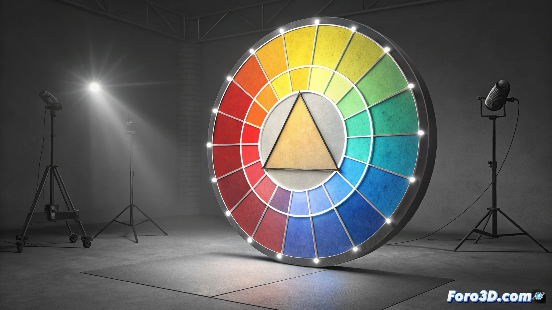
Triadic Color Scheme: Balance and Contrast on the Color Wheel
The triadic scheme is a method for combining colors that selects three hues positioned at equal distances on the color wheel. This arrangement, which forms an equilateral triangle, generates visually powerful and harmonious palettes. It offers high contrast but more subtle than that of a direct complementary scheme, allowing for eye-catching compositions without overwhelming perception. It is a fundamental tool in graphic design, illustration, and art direction when seeking defined and controlled visual impact. 🎨
How to Apply a Triadic Color Scheme
To use this method, first choose a base color on the wheel. Then, identify the other two colors that complete the equilateral triangle. A common practice is to designate one color as dominant and use the other two to accentuate or highlight specific elements. Saturation or value (brightness) of the hues can be adjusted to soften the combination if the result is too intense. This system is effective for hierarchizing information or directing the viewer's gaze in a visual composition.
Key Steps to Implement It:- Choose a starting color on the color wheel.
- Locate the two colors that, with the first, form an equilateral triangle.
- Decide which will be the main color and which the supporting or accent colors.
- Adjust saturation or brightness to achieve the desired balance.
A novice designer using red, yellow, and blue at maximum saturation may unintentionally discover they have created the perfect visual identity for an eighties traveling circus.
Advantages and Considerations
The main advantage of this scheme is the balance it achieves between chromatic variety and visual unity. It provides more options than a simple complementary or analogous scheme, helping to avoid a project feeling monotonous. However, using three pure colors with identical intensity can generate visual competition where no element stands out. It is recommended to test different proportions and nuances to find the optimal point.
Practical Considerations in Digital Projects:- Provides variety without breaking the overall harmony of a design.
- Requires careful handling of color intensity to avoid visual chaos.
- In 3D environments and post-production, it helps unify the palette of an entire sequence.
- It is useful for creating clear hierarchies and guiding attention in a scene or interface.
Conclusion on Triadic Use
The triadic scheme is a powerful chromatic strategy for those seeking contrast and dynamism without sacrificing balance. Its correct application, playing with dominance and saturation, allows for creating visually impactful and well-structured works. Mastering this method significantly expands creative possibilities in any visual discipline. ✨